SamSuka
davebarrack
davebarrack

patreon


Book 1 Cover pencils

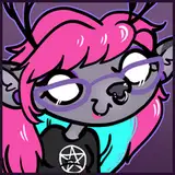
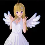
There are a few tweaks left to do, Arianna's eyes look a little off kilter, and her neck is... weird, scooch the Harems up a bit so there's less chance her chin will get cropped, stuff like that, but this will probably be the cover for the book when it's done. It's not great long distance composition, that is, I don't think it wouldn't catch your eye from across a convention hall if it was blow up as a poster. That sort of thing requires one or two characters at most, slightly off center with strong color choices and lots of contrast, but I think this will look good when people are holding it. I didn't want to give away the orbs on the cover either, so that limited what I could do with Sydney as well. 

Book 1 Cover pencils

Comments

I like how the gun is colored qlreasy

Arieth Ninja

Still haven't made that clone yet huh? pretty sure some of us would volenteer to help you for the price of a free signed book. (FYI, i dont know which i want more, signed book or kindle version)

Arieth Ninja

Hi there! :)

MegaRdaniels

Thanks for the feedback. I put Sydney in the position she is presicely because she's supposed to be clutching onto the tube and being a little defensive of it, but I'll definitely move her up a bit. I'll see if I can scoot her over a bit too so I can enlarge the Harems, but there's 3 of her crammed in there so it may only help a little.

Dave Barrack

Hello, this is my first time responding to things but I just wanted to comment to make a few pointers in terms of the cover. Sydney being the main character needs to be moved higher so that all the lines meet at her eye level and she should be bumped up is size to be proportionall bigger than the rest. All the surrounding characters should be roughly the same size to each other. On positions of characters, there's not much to say as their just real busts but Sydney should have a more open posture. She's partially turned away and her arms are crossed (shes holding the cannister makes sense) but crossed arms make her closed off which in turn makes it over all look uninviting. Her turned at a 3/4 angle in itself isn't bad just coupled with her back angle (she almost looks slouched) and crossed arms make it less appealing. That's just my two cents because I studied graphic design, I love your work and I want the best for you and your creations. (Overall it's a great cover for a first book.)

Fiona Schlageter

Yeah. And I'm slightly terrified. Everyone says running one is a full time job, so I'm going to sit in the corner and try to bud a clone.

Dave Barrack

Will you be doing the book through Kickstarter?

Brian

I think that would help. If you could shift her up so that those diagonal lines met somewhere below the middle of her head instead of near the top, it would encourage the viewers' eyes to go to Sydney.

Steven Karp

Yeah I was looking at that, at first I thought I'd have a row above the main characters with some villain silhouettes, but decided against it. I can try sliding Sydney up a little.

Dave Barrack

I approve of Arianna's disappointed glare :D

Goldwyn

Bother. Hit Enter by mistake. Anyway, my problem with the cover is that, to me, it doesn't look like Sydney is the main character. She's more than halfway down the page and smaller than the characters at the top--I'd be likely to pick them out as protagonists.

Steven Karp

Take this with a grain of salt, because if there's one thing I'm not, it's a graphic artist.

Steven Karp

I like it Dave. I like it a lot. It encompasses all the main characters and is quite cohesive. I am really looking forward to owning the book now that it has a cover to go with the idea.

Grayson A Judd


More Creators