In this post you will find some updated art, and a short report on how Eurofurence went this year. Before I begin, I would like to apologize for the absence. Once again, I kinda managed to burn myself out, and after the con I was too weak and sick to give so much as a peep, probably also because I’ve been mulling things over. I did manage to get one nsfw piece out on Subscribestar, and no nsfw artwork will make it onto Patreon this time either, for fear of a sudden ban. Do ask for the Discord and/or Telegram channels in DMs, if you haven’t <3

(Above: blue anthro dragon (Aapty) lying down on sun-pattern quilt in a psychedelic desert landscape. Pink flame on him and a stylized joshua tree.)
In my efforts of emphasising and improving my range of SFW artwork, I often look back on older comms. In the preparation for the con, I needed to take stock of the prints I had, and imagined myself as a person browsing the booths. I quickly came up with a non-serious rating system that allowed me to approach why some of my works had sold well while others had not, regardless of my feelings toward them.
For that purpose, I randomly chose three factors that quickly draw someone’s attention to art. Sex Thrill (S), Projection (P) and Decoration (D). They weren’t objective at all, just taken from my casual experience - and specially designed for what might sell at a convention. S alone won’t make someone buy a piece - it needs to have Decorative value at least. This allowed me to take out a few close-up shots that were adding variety, but had not been bought. By P I mean, ‘does it speak to me’ - so, is it an artwork I can identify with. Some of my older artwork had less of a clear-cut message that could be easily felt. There is also the question of whether the vibe is too general or too specific. (For instance, value can be found in connecting an individual struggle to a collective struggle.) By D, I simply meant whether someone would actually want this to be on display. Everyone is different, but the aesthetic value of something can sometimes be enhanced by taking another look at the composition. Anything that was ambiguous or niche or vague would either need to be improved or scaled down. I even went so far as to give the pictures alternative titles that summarized their appeal quickly. Ultimately, I also had to ask - what would appeal to me, what are my likes? How can I let those shine through more and have more quality conversations? I think it was a healthy step, even if it took time to develop, because it looks at my output as a whole, and as an interface between me and people I might really like to get to know. It's impossible to objectively tag yourself and all, but when you're offering art from several stages of your life . . .

(Above: White Dragon seen from front spitting blue fire. Post-It-Note says: +P (Projection) for stronger, harder shapes, cleaner silhouette (also +D) Rage is unfocused!)
Later on, I allowed myself to edit some of these pieces. Firstly, to feel more consistent and presentable in the range of things I was offering, secondly, to search those pieces for what I was saying with them in the first place, gauge whether I might not specify or improve that message or vibe or total package in some measure. This often meant abducting what had been a commission into a personal artwork. Sometimes the client’s character would not change in appearance, which could bring the risk of saying things through an OC which their owner could disagree with. On principle, I would always inform people of the alteration, and if someone were to decline, I would always be ready to change the character’s design more, because I realize the message I’m putting forth is my own. My gratitude goes to everyone who allowed these things to proceed. It turns out that some people I look up to a rather great deal found particular value in such a modified artwork, one of the two motivational postcard designs I came up with.

(Above: Werewolf holding book and drooling over laptop, wearing headphones. Expression seems a little dazed. Background: bookshelves. Some fallen over. Held book is exactly over crotch. SFW edit is obvious.)
One of the more pressing interests in my art journey is my passion for written text and how to combine it with visuals. I often try, but initial attempts fail, leading back to a safer strategy. Nahyon is an artist I admire for their commitment to boldness of type (and attitude, to be honest!) But maybe, the text shouldn’t be the immediate goal if you don’t know what the artwork is saying just yet. In the case of the aforementioned postcard, there was no desire to present any kind of text from the outset - the idea came on its own. The different ways people had responded to the “Gooning Werewolf” picture made me realize that even something so goofy could remind some folks of their desire to regulate their porn consumption. Further, that the ferocity of a werewolf could be a metaphor for other states in which we aren’t in control of ourselves, acting against our best interests, such as when we are possessed by productivity and burning the midnight oil. It was easy to present the werewolf as a person in a library holding a book just in front of their crotch, the most obvious sfw edit for the most obvious comparison: Both werewolves are very transformed. That was when I knew I needed to emphasise the light-heartedness of the card, and capped it with a slight character design change from the original. For fun, I included a massive French press with an accompanying coffee, a rumpled three-wolf-moon shirt, a bag of coffe „BEANS“ and changed the glowing red sign from saying „SEX“ to „WORK.“

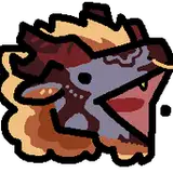
(Above: green horse stands over crawl-crouching humanoid with smaller human striding forward on shoulders. tiny human has star for head. lots of green horses in background, sort of tumbling through the air. CARRY at top of canvas, BONE at bottom. Dark letter-shapes look like an x-ray onto red bones.)
Another perhaps a bit rushed artwork was CARRYBONE, a piece about that world we might return to by touching grass. It features a large green horse taking up the majority of the composition in a relaxed standing pose, peering down at a headless humanoid with a forward-striding little human on its shoulders. Grass and some background horses make up the remainder of the image. Within the letters, bones become visible, both in the green horse as well as in the earth underneath, as though they were some kind of x-ray window. Stupidly-of-me, this x-ray window reveals that the horse is missing ribs and that its neck vertabrae are curving upward instead of following the neck - those mistakes were a result of my urgency, so I spent like 10 bucks on prints that I will never sell now. Great. Anyways, colour-wise I would align the verdant green with something like a natural state outside of human construction, or a sort of direct experience of the world without any thought - words and signs - intervening. Maybe the green can here stand for how the world is always renewing. Within this eternal change, there is the form, the unseen bone on which life ebbs and flows. We often think of the intellect as something powerful, enabling our apparent superiority - but we are standing on the shoulders of a giant we cannot control with reason. Modernity is a little like that tiny man, ready to subjugate sacred life to its progress. And yet, it is words, the material of intellection, which expose that bone. It is red in contrast with the green. I’m not sure why. My first association is to the reds of Franz Marc, to whom it represented the rawness of matter. Red is the first colour of life in a way.
To be truthful, I didn’t really choose the words. They felt appropriate. In one way, they remind me of the vertabrae of horses, the bones that carry the bulk of the rider’s weight, or, to avoid domestication, of how horses are able to stand and walk for long periods of time, how bones are a mechanical necessity when dealing with omnipresent gravity: That which pulls down, that which ties, the condition of being we desire to lift up from. Bones remind me of evolution, the dance of mutual influence between a species and its niche, how even the proportion of the skeleton gives insight into what movements a body is best capable of, adaptation. Different bodies will give rise to different minds, and bodies must move in order for minds to know space, or else we would not be able to think at all: even abstract language derives from concretisms, the history of words gives insight into how we are still porous to the world. I suppose I’ll finish that thought after some more Owen Barfield, and maybe pull out some etymology . . .
Further. Horses are what they are, so of course I had to make more horse art. I managed to polish a recent sketch just before I had to leave, and had it printed the same morning my train left for Eurofurence. The image is titled “Spirit of the Body,” an over-literal translation of “Esprit de Corps,” a skill/character portrait from the game Disco Elysium, in which human faces blend together with a similar vibe. Disco Elysium features a very fragmented protagonist whose psychic and physical functions can be levelled up as skills, but also speak as characters. Esprit de Corps is his cameraderie for other cops. Disregarding the complexity of the cop topic, the herd mentality translated well to equines. While the original human skill portrait gave me the impression of being observed with scrutiny by a group I am not a part of (maybe reflecting some of the protagonist’s anxieties?), I painted the horses with the intent to include the viewer in the blend. Maybe to do with a difference in character, who knows :) it simply felt as if this was truer to the literal meaning of a single spirit of the whole body of the group. Part of the fun was going from front-facing portraits to angles at which horses might need to look at you, because they can’t see what’s right in front of their faces. The dorks! Just look at em.

(Above: purple horse faces blending into one another and staring into your soul)
YET another very particular artwork about a very particular piece of horse anatomy had been on my mind for too long not to be made. I’m afraid the Patreon post cannot feature this art piece due to Patreon’s rules, but I’m inclined to upload it as soon as possible anyways . . . It’s a golden wang ensheathed in green. You could call it a corn-cob dong. Corn on the Cock. A whole field of them, even. ‘Ein Cock im Pornfeld’, is what Vulniir called it. (It’s a reference.)
The history of the idea goes back to just before last EF, when I was trying to come up with stickers to print. A certain tulip-looking sticker, a flare in some leaves, betrayed some weird ideas underneath a joke. Something-something fertility and cultivation. Further, just as with Carrybone, this feeling of something underlying, but this time almost dangerous. Having worked in furry porn for a long time, I do get a sense that there is an aspect of worship to some of the phalli I paint. However, I feel deeply conflicted, certainly moreso after a long and scary episode of worrying about HIV earlier this year. I am able to paint this subject again and again and again in a way that pleases people, and this does constitute a foundation of my livelihood, but I am not always at ease with what I am reinforcing and putting forth. There can be consequences to indulgence far beyond STIs and such, and seeking pleasure is simply not an act of picking flowers from a meadow. Sexuality can be fraught with self-contradiction. What bubbles to the surface is out of my control and can lead to unseen destruction. For instance, I don't fully believe that my HIV/cancer obsession and other forms of "research" happened as a purely logical result of risk exposure, but also because gut feelings such as visceral fear force me to become aware of something I was not aware of before, and make a choice of ignorance or responsibility - within reason. Ultimately, penis is not altogether avoidable. That is why the phallus has to remain sacred - as it may be, to an extent, for quite a few people who chose to be vulnerable by commissioning me for sexual artwork. Finally, I would like to add that I do not disapprove of porn. In fact I believe it's as important as ever, in the face of real bans and restrictions, including the one preventing me from sharing this artwork with you today on Patreon.
Either way. What inspired this visually? I had the idea while looking at a painting called “Regnskogsaltare” by Swedish painter Bengt Ellis. Unfortunately there are no good images of it online, but I have a photo that I would share with whoever asks me for it. The rainforest scene with its strong perpendicular lines and dripping green over a bassy red was electrifying, a primal hymn of shadows and snakes. And snakes looped me back to the phallus, ideas of being lost or allured. A bit of Alex Grey might have helped it along. In the end though, I feel like my skill isn’t quite enough right now to really make it sing. You should have seen the Ellis painting in person, whoah.

(Above: firefighter anthro opposite himself as the fire, text to the left reads in Gothic letters: Face Your Fires)
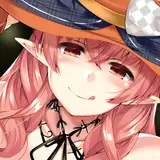
Other modifications made to my art were less extensive. The second postcard design follows along the original message of Swifaut’s firefighter picture. For Aapty’s commisison (see the 1st image of this post), I added a burning bush to the already weird desert, and a few more psychedelic elements. In the piece of Silas I had done for Nematious, I felt a certain femme fatale vibe, as if she were both leading the viewer through the forest while also tempting them. A piece of wisdom from the game Golden Treasure (which is in itself a golden treasure) fitted itself perfectly at the top of the tapestry I designed from it: All Homes are Traps. This being the wisdom of a spider, I made sure to add a few cobwebs. Several other modifications were begun and had to be left unfinished as the last few days ticked off the calendar.

(Above: Feral wolf-dragon female leading the viewer into the forest, looking back at them. Her tail is bottom right. Text above says "All Homes Are Traps" - not all HOMOS! I had to change the e because someone made fun of it ;; lmao)

(Above: Portrait of Theo looking a bit deranged, drawn in acrylic marker. Theo is a horse-looking felkin, which is basically a pointy horse.)
Desperate for some last-minute bookmarks, I cut two lino plates in record time and attempted to print them unsuccessfully, which spiritually busted my nuts. Thanks to a call with a friend I was able to give up on having them at EF. They would not have been worth the time investment. The reason for why the prints came out bad was that I was trying to print them by hand on paper that was far too thick and coarse. That type of paper would need to be used with an actual press, and no matter whether I gave myself a pec workout or stood on them, they looked like garbage. So today, I decided to return to the flimsy hand-printing paper and use some non-wrinkly glue to put together a bookmark that way. The ribbon is made from biodegradable ecocell (kinda hard to find!), the loop shut with fabric glue, the square hole punched with a tool . . . it felt really nice putting it all together. And now I’ll use the bookmark to get a feel for what I’d like on the next design, perhaps ;3 They might also make some good gifts. A simple printing press has been ordered.

(Above: sample prints on wrong paper underneath an assembled mockup bookmark featuring tools such as ruler and paper knife, pencil, glue, roller and ink etc.)
The brief time window gained by giving up on lino prints was instead invested into the creation/finalization of nine traditional pieces to be exhibited at EF in the time span of literally like, two days. Of course I had to finish those while we were already in Hamburg. Of course we had to buy frames in Hamburg. Of course all the stores only had 20x30 cm frames instead of A4, which is 21x29.7cm, so of course the artwork needed to be folded in there, which resulted in two pieces tearing at the edge. FUCK. MY. ASS. I was manifesting anime levels of emotion. Sorry for losing control sometimes, to my friends and helpers, especially during table setup.
More information in no particular order:
- had to switch print service for paper prints, resulted in far better quality that also cost dozens of times more, invested over 650 Eur into that alone, 70 print designs had to be adjusted and dealt with in one go
- every order from online print service got messed up at least once but I managed to offer three new product categories :D
- 3 of the Art Show pieces sold. I think I could have priced the large ones a little lower - I put them up at 90 € because 100 would be the price for a fullbody commission of that size. If you want to buy one, you can hit me up. I'm thinking 50-70 would be fine for some of them. Others I'm a bit more partial to ;3
- Forgot to pick up art show money and ended up getting it anyways thanks to EF team dedication - still sorry about that :V
-Hosted 2 panels again, but decided that I’d rather have the evenings off next time. I do want a more furry-specific idea instead of covering all of Tarot! (I did a Tarot Introduction panel.)
By the end I was pretty pooped! (I just wanted to say that. Teehee, dookie.) Left Hamburg together with my friend Draakae, who stayed at my place until we were both too con-crudded to do anything except play Bloodborne. He’s got my PS4 now and he still needs to finish the DLC.
The Art Show pieces that sold:

(Above: two horses studied off of Bonheur's Horse Fair in ink and red acrylic marker. Size ca. 14x21 cm. Sold for 40 Eur)

(Above: beheaded dragon floating with swords and graphic, separated head to the top right. Lots of weird little musical marks. Was a study for a linocut I was making, but I'm not sure if I don't actually like this picture more . . . lmao. Size 14x21cm-ish, Sold for 40 Eur.)
One art show piece that I sold is missing here because it's a ginormous tool.

(Above: Blue horse standing under yellow ellipse-shape, something like smoke coming from the bottom left going to the top right, standing on angular crystalline shapes, maybe a bit like house-roofs - tbh, I feel like the plural of "roof" should be "rooves", not biased.)

(Above: horse rearing up, with some lines and shapes of energy)

(Above: herd of horses geometrically flattened, sort of looking like those mountain paintings where one mountain is almost like on top of the next . . . lots of weird shapes. Inspired by Franz Marc! Though it don't look it . . )
Three more A4-sized art show pieces are missing due to restrictions!