Note: This post has been made public for presentation purposes.
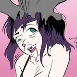
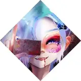
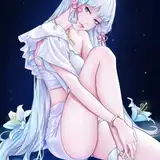
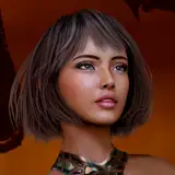
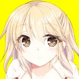
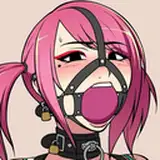
It's a Link! Who saw that coming?
It's a pretty basic illustration, using that watercolour style, though I was pretty relaxed during the entire thing. I wish I could slow down as often as I did with this without feeling anxious. I've also provided some of the steps, so you can get some insight to my process.
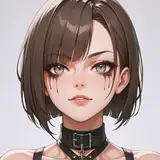
Simple enough, right? It's the drawing, itself. I have a rather loose & gestural stroke, but sometimes, I can be a bit firmer. That's why some of the lines appear darker -- they're transparent, but some lines are done with a heavier hand. That's usually an accident, but not a big deal.
On another layer, I begin by shading the piece as though it were a greyscale image. I fill my paint in, making sure to ignore the areas which are brightest. It's a bit like sculpting.
This is, I suppose, comparable to ambient occlusion -- it's sort of the casual shadows you'd see on an object. I try to create an interesting series of shapes, sometimes ignoring realism for design. Notice how objects appear shiny when they ordinarily would not?
I convert those blue shadows into colour. It's the same exact layer, just with transparency locked. That means anything that was a darkness value of 50% will stay 50% even when I go over it with another colour. This allows me to maintain my values, but still alter the colours in a safe environment.
I will also push a bit firmer in the "brightest parts". Sometimes I leave a bit too much of the paper behind my paints, and objects will look TOO shiny. So I just layer more paint on top of it to lower the contrast and make the shadows feel a bit more natural. You can see that I also added a bit more paint to her legs -- it's subtle, but the "white" of the page now only exists as a thin highlight along her thighs.
This is where things start to pop. I paint in the areas which are darkest: what ISN'T receiving light? The hair behind her head, her forehead, under her chin, the bottom side of her boobs. These are areas that receive less light because there are objects blocking the light source. It's a simple stage and it mostly serves to add additional contrast, especially if there isn't enough in the initial values.
Sometimes I'll do put a dark stroke along the edge of a highlight though, so it appears more shiny -- like in the cuffs of her boot. Notice how there's that slight bit of dark along the brightest part?
Arguably the funnest part of the entire process -- it's like Rossdraws Colour Dodge. I lightly paint in some glow effects. This is mostly about instant gratification.
The very top of her hair is brighter than before, with a slight golden light on it. This appears in other parts of the drawing too, but the head is where it's most important, as it's typically closest to the light source, and it's where I want people to look at first, so that added hue variation makes it feel nice & harmonious. It's just plain pretty.
I'll also use this stage to add some bounce light, or a thin layer of brightness along the edge of an object to add just a bit more dimension. This is mostly a design thing. It adds pop.
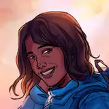
And back to the original image, we are finished. I'll usually clean up any loose ends and toss in a simple, abstract background of some kind.
Sometimes this process changes a bit, depending on some of the choices I made. But this is my general design direction as I move throughout the piece. I hope you enjoyed it.
Don't forget to eat & sleep.
brellom
2019-08-15 09:13:24 +0000 UTCFreeGlass
2019-08-15 08:49:06 +0000 UTCZBL
2019-08-15 08:34:24 +0000 UTC