Bronto redesign? (poll)
Added 2022-06-27 11:21:28 +0000 UTCI've been waiting on fluid sim stuff for the glamor hole thing and there's been something that's been bothering me with the brontosaurus.

The design as it is now I don't think is bad, but I think that it can be a lot more interesting and appealing. Like it doesn't make a lot of sense for a long neck dinosaur, I think. I've messed with stuff since I first modeled him, but I think what's holding it back from being something more is like, trying to do small changes.
I've been looking at various references, some furry art, but mostly common things about interpretations of diplodocus:

Originally, I wasn't skilled enough to figure out how to capture the essence of the long neck dinosaur and make it sexy. Clearly, a scalie long neck dino (bronto or otherwise) needs to have a long neck, a large body, a long tail, stout legs, and a tiny head (relative to the body).
I really didn't follow these ideas as closely as I should have, in my opinion. So instead of just messing with the original model, I set out to just start over from the ground up (the face and reproductive organs are the only things I'd pretty much copy/paste over)
First, I did this sketch.

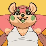
First, he's larger. Second, the body has more "oomph" to it. More pronounced muscles around the shoulders, with the idea that they need to be strong to support the neck. Also, thicker arms, more stampy feet. More torso, more belly.
Then, I did a sculpt.

It still a bit rough and the feet/hands I haven't really detailed much yet. But I think the new design is much more evocative of a brontosaurus. And the shape has a much nicer direction about it- maybe it's just me, but you can't help but just start at the bottom, then look up to the head. The shape is bold, attention grabbing.
I don't know though, maybe I'm just over thinking it, and trying to add way more spice to something that doesn't need much more spice? If it ain't broke, don't fix it, as they say. To me, I think the new version is a huge step in the right direction, however I don't know if it really is.
But let me know what you think. Is it even a good idea? Let me know if you think something about it sucks, or if it's *too* different, or if I shouldn't mess with the old design.
Comments
I think the current design is too bottom heavy. I think his chest should be made bigger or his legs smaller. If you look at your references you'll see that they tend to be more melon shaped while the current design is more pear shaped.
Nanimon
2022-07-16 11:21:52 +0000 UTCI think they pulled it off with a few characters in chicken little too, but it's been so long since I've seen it I would need to double check
The_Blue
2022-07-01 07:17:58 +0000 UTCIf you look at any anthropomorphic giraffes from zootopia, sing, sing 2 you can get a understanding on how to balance the head shape , and keep it properly scaled to the original bronto
The_Blue
2022-07-01 07:16:29 +0000 UTCI wasn't thinking too much about messing with the face (like beyond improving topology so it can be made more expressive) but that's an interesting idea- I'm looking at some stuff on google and I think I get what you're saying, but could you share some examples of what you mean exactly, if you don't mind?
Velocirection
2022-06-29 09:06:11 +0000 UTCGot it! The belly was giving me some trouble so it ended up like it did... but I was able to get it to more closely match the sketch!
Velocirection
2022-06-29 09:03:17 +0000 UTCThank you! That's what I'd really like to do, have some nice jiggle on the tummy and chest! I think that could be really hot...!
Velocirection
2022-06-29 09:02:05 +0000 UTCThank you! Got it! The head is very tiny, so I made it a bit bigger (1.2x). It's a bit difficult to match my sketch, but I'm going to try and get it more in-line with that. The reason I want to scrap the old design is just because the issues I have with it stylistically. I'm not skilled enough to formulate it exactly, but it looks amateur-ish. Like it lacks cohesion and a better sense of form, I guess.
Velocirection
2022-06-29 09:01:03 +0000 UTCAnother thing you could do rather than just making the head larger like a few people suggested you could easily bring out the nose to create a completely stylised version of the bronto . The best example work I can list is how giraffes were portrayed in sing, sing2, and zootopia.
The_Blue
2022-06-29 06:13:41 +0000 UTCI believe using the more anatomically correct version is the right way to go, but making the feet that small would pose problems for the character. In my opinion I think that keeping the larger feet would complement the bodies new curves, and highlight the stubby legs of the original species with the new proposed redesign. (It's just my opinion though, and I hope you like whatever changes your patreons vote on) <3
The_Blue
2022-06-29 06:08:55 +0000 UTCAs long as he gets a bigger butt I’d be satisfied
2022-06-28 23:15:30 +0000 UTCwider hips, smaller feet
TummyEnjoyer
2022-06-28 18:16:51 +0000 UTCChunky bronto!
AtomicReindeer
2022-06-28 05:54:06 +0000 UTCA chunky brontosaurus would definitely be appealing!
Arte Fawx
2022-06-27 23:27:39 +0000 UTCDefinitely looks a lot bigger over all, which helps!
Modem Leolynx
2022-06-27 22:38:30 +0000 UTCNot bad
Tusslesprout
2022-06-27 19:21:40 +0000 UTCloving the new look for him! the fuller, softer body type looks super cute, I'd def give him a bigger head tho so we can see his face easier 💖
OzzyTikatu
2022-06-27 19:08:40 +0000 UTCThe proportions on the new design are alot better and I think the chance to make his character a bit bigger would make alot more sense considering how big brontosaurus were
MystDragon
2022-06-27 18:23:00 +0000 UTCI agree with Joseph, head slightly bigger, smaller hips, . like more the sketch proportion, and how the belly continues to the back (?) sry for my english
gnef
2022-06-27 17:03:09 +0000 UTCI think the head is a bit to small for how big thay are
lazy_foxZ
2022-06-27 14:57:53 +0000 UTCI think you should do what you think is best.
Jake
2022-06-27 14:39:53 +0000 UTCI agree with Joseph
vincent
2022-06-27 14:14:24 +0000 UTCMake him more hefty like in your drawing It will fit him great
Auroraboy95
2022-06-27 13:59:38 +0000 UTCI'd second what joseph said about the head, maybe just make it slightly bigger. But overall I think the new design looks fantastic!
Bungus
2022-06-27 13:04:37 +0000 UTCI like the second design more. He's chunkier, and potential for belly or moob physics ^^
Neko Boy
2022-06-27 12:39:14 +0000 UTCNew design looks great though could use some tweaks, mostly personal preference but I think the hips could be a tad smaller (just a tad) and the head a bit bigger, head just seems too small for the body. The proportions of the sketch I think look better in my opinion. Also with the redesign it could just straight up be a new character, no need to retire/replace the old.
Joseph
2022-06-27 12:20:33 +0000 UTCOh fuck yeah, Bigger Neck means Bigger Cock and Ass!
VaStar
2022-06-27 11:26:39 +0000 UTC