SamSuka
deaver0211
deaver0211

fanbox


絵日記_絵柄に関して質問してもいいですか?

私の絵を愛してくれて500円という大金を支援してくださった皆さんありがとうございます!

かわいいネコプランを支援してくださる方々にどんなご褒美を差し上げるか悩んだ末、私が絵を描きながら感じる悩みを日記形式で書いて皆さんが意見を出すことができれば良いのではないだろうか。!

したくて月に1回ずつ日記をつけることにしました!

Thank you to all of you who liked my illustration and supported me with 500 yen!

I was thinking about what kind of reward I should give to those who sponsor 500 yen.

So, While thinking about what to do, I thought of a diary!

if I write down the concerns I feel while drawing in the form of a diary, Please give me your opinions!

That's why I decided to keep a diary once a month!
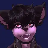
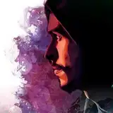
-----------------------------------------------------

なので今回のテーマは <絵柄> です!

色々な絵を研究していますが、確かにどれが綺麗であまり良くないのかが正直まだわかりません。

今は現在むりょたろ先生を真似ていますが、ここでもう少し多い描写と私だけの皮膚質感表現を加えて私ならではの個性を維持しようと努力しています。

でも、まだ自分の絵柄に満足していないので、いろいろ試しています。 もっとカジュアルに描いたり、あるいは実写感を与えたりしていますが、正直に言って何がいいかはわかりません。

So, the theme of this album is drawing style!

I'm studying various styles of painting, but I don't know which one is pretty or not.

Now I'm following むりょたろ先生, but I'm trying to maintain my own personality by adding a little more (?) description and expression of my own skin texture.

However, I'm still not completely satisfied with his drawing style, so trying many things. I'm drawing it more casual, or I'm giving it a live-action feel, but honestly, I don't know what's good.


今のこの絵を一生維持するのがいいのか、それとも描写が今よりは少し汚いですが、きれいな半実写イラストで描くのか、それとももっとカジュアルに描くのか、皆さんの意見が気になります!

現在維持していれば、多様な描写の追加ともう少し荒れた彩色方法を追加してみると、もっと絵がきれいではないかと思います。

悩みです...!

I wonder if it's better to keep this picture for the rest of my life, or if I should draw it with a pretty semi-real illustration or more casual, although the description is a little dirtier than it is now!

If it's better to maintain it, I think illustration will be much prettier if I add a variety of descriptions and a rougher coloring method.

That's my concern.

-----------------------------------------------------

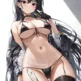
何より一番の悩みは肌の描写ですが、柔らかすぎるのもいいですが、水彩画のように塗られてほんの少し粗い感じがするのもいいと思いますよ!

これは皆さんが選択してほしいです!

恐らく最もよい例としては

※R-18注意!

The biggest worry is the description of the skin, but I think it's good that it's too soft, but I think it's also good that it's painted like a watercolor and feels a little rough!

I want you to choose this one!

The best example is...

※Beware of R-18!


この2つの写真の違いだと思います(特に胸!!)

どちらが良いかは皆さんの意見で決めます!

I think it's the difference between these two pictures.

I'll decide which one is good based on your opinions.

-----------------------------------------------------

最後にはその...乳首について気になることがあるんだけど、

どのくらいの大きさで描くか毎回悩みます。

今まで私が描いたものの中ではどんなものが一番良かったですか。

乳輪と乳頭の大きさをなんとなく私が気にしてるから、ぜひ聞いてみたかったんです! 最も重要なポイントだと思っています!

Lastly...I have a question about nipples.

I think about how big I should draw it every time.

What was your favorite drawing so far?

I care about the size of the areola and papilla, so I really wanted to ask! I think that's the most important point!

-----------------------------------------------------

確かにこれ以外にも悩みはたくさんありますが、今すぐ気を使う部分です!

一人ではやっぱり決められないので、みなさんに手伝ってもらいたいです!

みなさんがどんなものが好きなのかも知りたいです!

ご意見いただければ本当にありがたいです! ぜひ参考にします!

長い文章読んでくれてありがとうございます!

I definitely have a lot of worries other than this, but these are the things I'm paying attention to right now!

I can't decide on my own, so I want to get your help! I'm curious about what you like, too!

I'd appreciate it if you could give me your suggestions. I'll keep that in mind!

Thank you for reading this long comment!

絵日記_絵柄に関して質問してもいいですか? 絵日記_絵柄に関して質問してもいいですか? 絵日記_絵柄に関して質問してもいいですか? 絵日記_絵柄に関して質問してもいいですか?

Comments

Your art style really fits for girl's like okayu, while fubuki seems to have the same proportion and thickness that do not fit well with her. Fubuki still looks great but you see a lot of similarities between the two illustrations. One last thing, I feel like the breast on fubuki should be sagging more. 🙏(´∀`)♡

Noxas

まず、僕は乳輪は小さいのが好きってのと、新衣装おかゆんと水着フブキは、新衣装おかゆんの方が好きってことです

Thank you for your reply. Looking forward to the next drawings(especially Korone R-18)!

Toraf

Thanks for your reply. I don't have a problem with the balance of my head and face itself, I just feel that it is slightly smaller from the neck up in proportion to my body. In any case, I love your pictures and will continue to support you. Thank you for all your wonderful work.

こるそあ

違いますよ! すごく役に立ちます! 私一人では絶対に絵を描くことはできないので、皆さんの意見を本当に大切に思っています! 確かに気に入ったら幸いです! ご意見ありがとうございます! そして長い間私の絵を好んでくださってありがとうございます!

Deaver

Thank you for sharing your opinion! My opinion is definitely the main focus, but I can't ignore your opinions, so I asked you this question because I'm always thinking about it! Thank you for your kind words! Thank you for telling me about skin and nipples! I'll always provide you with good illustration!

Deaver

Thank you for writing a long message! It was a good reference! Can you tell me exactly whether the face balance is collapsing, is it a problem because the head is smaller or the size of the head and the ratio of the face part do not match? I think I should definitely fix it when it comes to this! Thank you for liking my illustration for a long time! I will continue to draw Nekoyama-san! Thank you!

Deaver

Thank you for telling me the details! I'll keep that in mind! I'll keep fubuki in mind, too! Thank you for always liking my drawing!

Deaver

みんな好きになってくれてありがとうございます!

Deaver

Thank you for your opinion! I certainly understand!I will refer to! Thank you for liking my recent illustration! I'll continue to provide you with great works!

Deaver

今のディーバさんの絵の感じはとても好きです!でもディーバさんがもっと自分ならではの絵柄を目指すのであれば、それを応援します! 肌の質感はどっちもそれぞれの良さがあると感じます。キャラがいる場所の光加減が違うのでどっちが絶対良いとは言い切ることが出来ませんでした。 乳首は最近の絵を一通り見たのですが、今の大きさがちょうど良いと思います! ディーバさんの悩みにあまり役に立つ事を言えなくてすみません。

火日木

あ, 水着 おかゆ! 間違えてしまいました! ありがとうございます!

Deaver

確かに柔らかい胸やお尻のような部位はもっと柔らかい描写をするべきでしょう! 水着って夏休みなんですか? 参考にします! 私が顔を成熟に描くことはできない体なので。。。今度体を成熟させてみましたが確かに顔とマッチングできない感じです...!この点もちゃんと覚えておかないと! ご意見ありがとうございます!

Deaver

Thank you for your detailed opinion! I was able to understand and judge more accurately! I'll keep that in mind next time! And Korone R-18 will be provided within 7 days, so please wait a little bit! Not only this time, but next time, I'll be upload another Korone R-18 again!

Deaver

Thank you for your suggestion! I'm sure everyone has a different taste, right? Thank you for giving me a good opinion!

Deaver

ご意見ありがとうございます! 確かに少しは水彩画っぽい方が私は個人的に好きで、聞いてみたかったんです! ちいさなものか…やはり小さく描く人もとても多いので、キャラクターごとに違う描写をしたほうがいいですね!

Deaver

ご意見ありがとうございます! 正直僕も…大きいほうがいいことはいいです。 後で別に動きある胸を描いてみます! 必ず描きたかったです! 新しい構図も試してみます!

Deaver

What Deaver said is true and can't figure it out on his own and have to negotiate with everyone, for the theme of drawing will be better in your own way but if Deaver wants to follow other people that's fine as long as it's true. for both good casual and live-action.more It's okay to maintain it, for my skin tone I prefer Okayu because it's a little natural compared to Fubuki. Nipples are better with medium size, not too big and not too small. something in excess must be bad and I love Art Deaver until now がんばって

Ts Yuna

I think you can build your own style naturally by maintaining the status quo and occasionally adding elements you are interested in, or (if you make a mistake) undoing it. As for the texture of the skin, both of the examples you provided are attractive, and I can't say one is better than the other. I like them both. As for the nipples, "Okazu (R-18)" is my favorite. The moderate swelling of the nipples is wonderful. As a whole, I feel that the wholesomeness of the flesh is wonderful. However, I feel that the balance of her face has been lost recently, perhaps because she is conscious of her small face. The samples in the "Which of the following R-18 illustrations would you like?" post all seem to have a good balance. I really like the pictures you've been drawing since late last year. I'm really looking forward to seeing more of Nekoyama-san's naughty activities. Please continue to show us your attractive pictures. Thank you.

こるそあ

I like the way the skin turned out in your Okayu drawing, it adds more depth overall and makes it more attractive to the eyes. As far as nipples go, I like how the Fubuki swimsuit ones turned out. Thank you for all the wonderful drawings you’ve made. We all love your work!

Seismic

全部好きなのでお任せします。

I prefer the skin in the Okayu picture, it seems like it has more detail and shading. The way you draw nipples always looks good, but I particularly like them in '夏休み (R-18)' and '水着 おかゆ (R-18)'. My favorite has to be your most recent work, 'シャツを貸してくれてありがとうー(おかゆ)'.

skybolt226

肌の塗りはおかゆんフブキちゃんどちらも好きですね ただムチムチ好きなので水彩画が強いと硬そうに見えてしまうかな… 乳輪乳頭は大きい方が好きです(パフィーニップル? 1番好きなサイズは水着おかゆん 塗りとは別の部分ですが、最近は童顔+高等身になってきてる印象かな

古い鉄

About the skin, I think it looks better in the second picture. That's just my opinion. But the first one is just as good. About the nipples, for me they are best drawn here エチなおかゆん (R-18), here お腹触ってみる? (R-18) and here 夏のミオしゃ (R-18). But I think they are great in all your drawings! But everyone has their own opinion on it. And my favorite drawing, in both versions, is this one エチなおかゆん. And I'm really looking forward to Korone(R-18). I've wanted to see this version of Koro-san for a very long time. So I'm looking forward to this work and THANK YOU to everyone who chose it!!!

Toraf

I really like the way the Okayu picture was drawn. I’m not an artist myself so I can’t really explain why. As for nipples, I think everyone will have different opinions. I personally like them small but don’t mind them big

sssonku

私的にはおかゆの方の描き方が好きです! おっぱいの少し垂れてる感じとかがリアルで好きです! 乳輪と乳首に関しては、少し小さくしてもいいかもしれませんね(*´ω`)

私としては、乳輪が大きく乳首が大き目なのが好みでありますが、変化を取り入れるのであれば、『陥没乳首』『少し濃い目な乳輪』『左右動きのある胸』なのど、いつもと違った構図にしてみるのも良いのかもしれませんね。

モモンガ


More Creators