Last month I drew a page of comics art that pleased me more than anything else that I have drawn during the past two years.
After 12 hours of brainstorming, arranging, and drawing, I walked away feeling satisfied and proud.
Afterwards, for some reason, I couldn’t stop thinking about that page.
Because I am so happy with how it turned out, I decided to write this blog post explaining my satisfaction.
For a start, here is the page that I like so much:
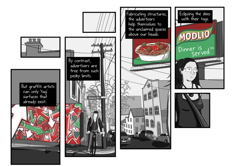
It is the p9-10 double-page spread of my latest comic Tagging Public Spaces.
Now, let’s dig deeper into why I like the page so much.
Let me emphasise that I am proud of this page as a work of comics art, rather than as an illustration.
In other words, I am proud of the particular combination of these elements:
To show what I mean, let’s have a look at the illustration itself, with all of the borders and text removed:
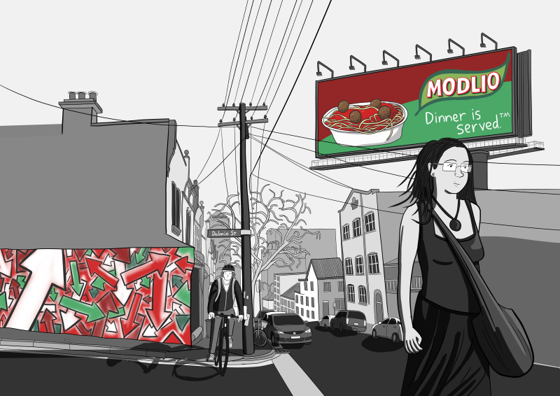
The illustration is nice. But it is also pretty run-of-the-mill. Without the text and borders, it lacks the purpose that it serves in my Tagging Public Spaces comic.
Let me explain further what I mean by the purpose of a comics page.
My job is not a cartoonist. My job is not an illustrator.
My primary job is a comics artist.
There is a difference. Comics is about storytelling. Comics is about the panel-by-panel communication of an idea to the reader.
In other words, the illustrations are just one of the many simultaneous elements that comprise a comic. The text, panels, spacing and arrangement are equally as important as the illustrations themselves.
Because of this, illustrations are a relatively minor component of a comic. Illustrations that do not serve the story of a comic can be a detriment to the reading experience.
Every page that I draw is experienced by the reader in context with the other pages of the comic.
My readers read my comics by scrolling from from left to right, as you can see for yourself. So I have to think about how each page relates to the previous and subsequent pages.
Here is a look at how this Dolmio page fits with its neighbouring pages:
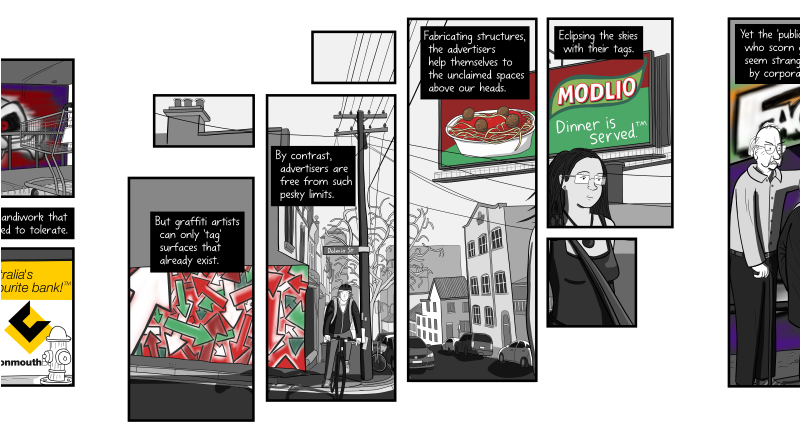
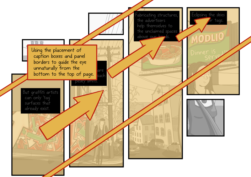
As you can see, the reader finishes the previous page with their eyes near the bottom of that page, where the black caption box is. And the reader will begin their next page with their eyes in the black caption box at the top of that page. So with this page, I needed to span that gap.
As a comics artist, my job is to guide the reader’s eye across the page.
As the reader’s eye travels, I must use the combination of text and artwork to reveal information about the story that I am telling.
Here is the path of a reader’s eye across this page of artwork:
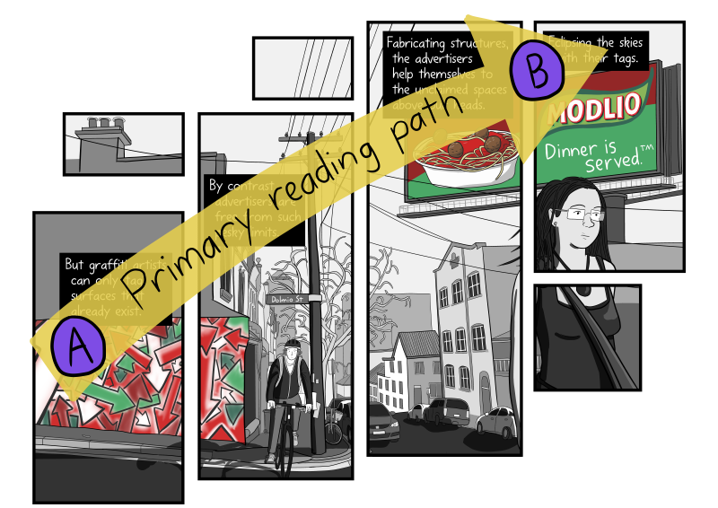
Please note how all elements of the page help to guide the reader’s eye from the bottom-left to the top-right:
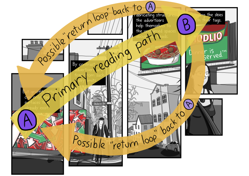
After this initial read, the compositional elements encourage the reader to scan across the page one more time.
After reading the four large panels, the reader notices that there are three smaller panels that reveal more part of the artwork.
These encourage the reader to circle back towards the spray-painted wall in the bottom-left, and to then have one more scan across the page.
My primary reason for breaking the scene into panels was to raise the viewer’s gaze towards the sky, as though they were looking up towards the billboard. Each panel provides a ‘step’ in the staircase towards the next destination. To create those steps, the gaps between the panels become important compositional elements.
As Scott McCloud famously highlights in Understanding Comics (1993), it is the spaces between the panels that most engage the reader’s imagination.
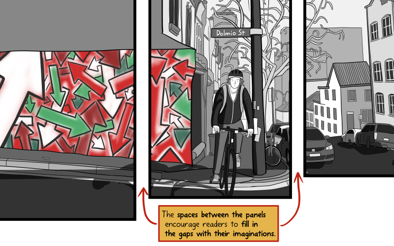
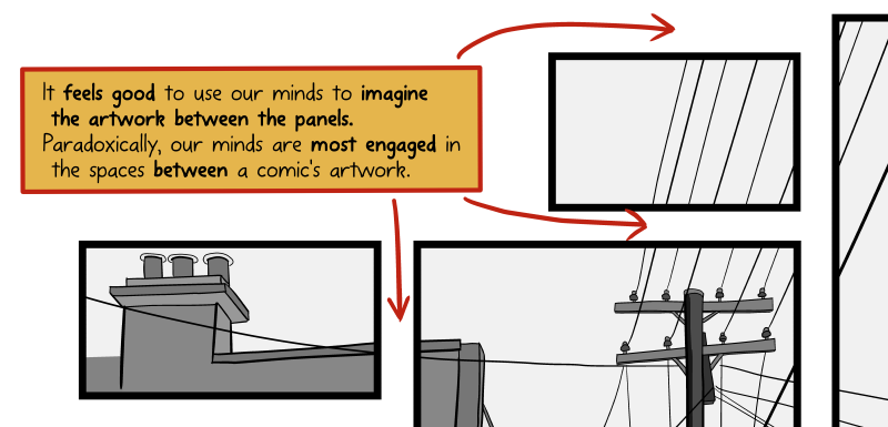
The blank space between the panels gives your brain something to do, as it mentally fills the gap. In this Dolmio scene, we imagine the missing arrows on the spray-painted wall, the missing car windshield, or the missing overhead power lines (above), and it feels good to use our imaginations.
The broken-up scene simply looks more visually interesting than the single unbroken scene does. (Again, see the comparison at the top of this page).
Another reason why I like the page is because the composition matches the purpose of the page.
My comic, Tagging Public Spaces, draws a comparison between billboard advertisers and graffiti artists. Earlier in the comic, I argued that billboard advertisers claim the visual spaces of our cities in the same way as the ‘tags’ of graffiti artists.
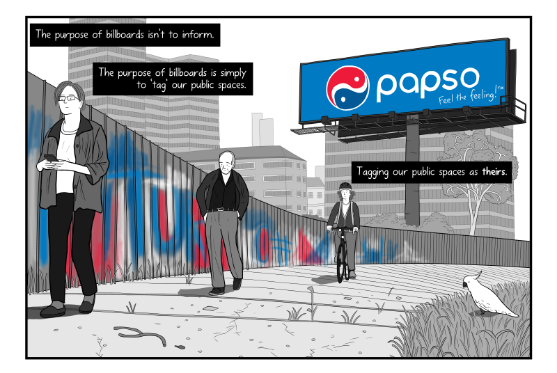
Above: image from the Tagging Public Spaces comic criticising billboards as being corporate ‘tags’ similar to graffiti ‘tags’
Yet, the purpose of the Dolmio page was to go one step further. The purpose of this page was to argue that actually billboard advertisers are worse than graffiti artists. Billboard advertisers are worse because they claim the skies with their structures.
Knowing the purpose of the page was important, because I knew that I needed to directly compare a graffitied wall with a billboard tower.
Since we are so used to reading from top-to-bottom, I needed to find a way to make the reader’s eye move from bottom-to-top. As described earlier, I used the text boxes, panel arrangement, and composition to do this work.
I’m so glad that I could create artwork that served the purpose of the page with such effectiveness.
I understand that most readers of Tagging Public Spaces would not have noticed these compositional factors when they read my comic. To them, the page would have looked relatively unremarkable.
That is largely because the role of the comics artist is to do as much work as possible to make sure that the reader has a smooth reading experience. If you are skilled, the reader will not even notice the subtle decisions that you made when composing the page.
I am reminded of a scene in the fantastic documentary Tintin and I, where Hergé claims that he only drew two panels that he really loves. At first glance, those two illustrations look relatively run-of-the-mill and unspectacular. But on closer inspection they are expertly composed.
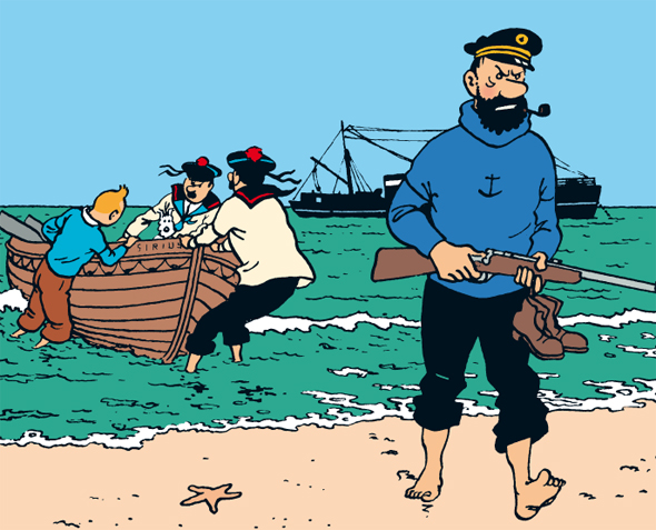
Above: Hergé’s two favourite Tintin panels. Watch the documentary to hear him say why he likes them so much.
In the immortal words of Mr. Plinkett, you might not have noticed, but your brain did.
I was inspired to write this blog post after mentioning how happy I was with this ‘Dolmio’ page on social media. My reader Brian asked if I could explain exactly what it is about this page that especially pleases me.
My satisfaction with this Dolmio page has directly inspired me to re-conceptualise some of the pages of my upcoming comics from my Twenty-Five Arguments Against Billboards series.
Hopefully this article explains why I like this page so much, and gives insights into the deliberate choices that sit behind my compositions.
This essay was originally posted on my blog.
Stuart McMillen
2019-03-19 21:50:17 +0000 UTCParam
2019-03-19 06:38:52 +0000 UTCSophie Benjamin
2019-03-19 06:33:34 +0000 UTC