Cover Feedback
Added 2021-05-31 04:33:18 +0000 UTC
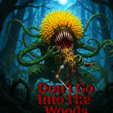
Hey everybody. Its been a while since this was posted, and we are inching towards completion of the official cover for the release. Still lots of stuff to get done first, but this is a good step forwards.
I just wanted to request everybody's feedback before we 100% this.
Edit: The reasoning behind the letters being like that is I wanted a kind of contrast between the peaceful scene, and the more aggressive looking lettering.
I just wanted to explain that choice. Thank you for the feedback so far!
Remember 1 thing though It's ego versus Art When people have a big Bold print Of their name is the biggest thing on the front cover you see the Some really famous Arthur's Or you see the the books cover is being really big saying that they think the book is a lot better But when you can't see the author's name at all That's a confidence problem
Andrew
2021-06-03 23:32:47 +0000 UTC
It's because of the shadow You can see the tree shadow and it looks like everything pulled together when you look at the person shadow it isn't really there I love the background I feel like bob Ross should be proud
Andrew
2021-06-03 23:28:29 +0000 UTC
The lighting and shadows in general seem a bit off or disconnected
Leander
2021-06-01 05:16:48 +0000 UTC
The feet of both Jin and Bi De seem strangely disconnected fron the soil they are standing on, almost as if they were floating (or they were later put on top of an already finished background). Does anyone else see this or am I too harsh?
Leander
2021-06-01 05:11:58 +0000 UTC
we tried, it took up too much space
Casualfarmer
2021-06-01 02:09:04 +0000 UTC
It does have 6 illustrations in it
Casualfarmer
2021-06-01 02:08:48 +0000 UTC
It looks good, but I'd try to make your name bigger, so that it's readable when it's a thumbnail, because that mostly how it's going to be viewed. It's also unusual to give the artist credit on the cover if it isn't a illustrated book.
Chong Go
2021-06-01 01:49:33 +0000 UTC
Why not make the title like a warning sign?
Mr Catz
2021-05-31 23:19:31 +0000 UTC
Make the title the sign, exactly how Jin draws it
matthew gilley
2021-05-31 20:39:42 +0000 UTC
I love it tbh. Love the font. Picturing big d with anime glints in his eyes.
Connor
2021-05-31 17:50:08 +0000 UTC
how about making the font more normal and if you want to imply the cultivation thing just add some unusual plants, not that he has any yet....
A disgruntled nondescript squirrel
2021-05-31 17:03:26 +0000 UTC
The font is a little off. Maybe try making it farm-ish? Like, say, a wood font? Or even fence font. I feel like that type of font would better convey the essence of this novel.
2021-05-31 16:24:10 +0000 UTC
I think that the cover don't transmit the essence of the novel enough, even with the font.
I would put a double cover or use a even stronger font.
Guilherme Silva
2021-05-31 16:04:42 +0000 UTC
My only suggestion is to make the font on the bottom slightly bigger
Damian
2021-05-31 15:52:00 +0000 UTC
for font, you can always keep the same font for the «chicken» but have more generic font for all else.
General Use Only
2021-05-31 15:41:45 +0000 UTC
The font reminds me of young adult horror and b movies. If you want something other than block, you could go for some kind of calligraphy. Bispo is a very sweeping but easy to read font on Font Squirrel.
2021-05-31 14:43:49 +0000 UTC
I think it's great. If you add a rooster warning sign on the right it would make the whole thing perfect!
General Use Only
2021-05-31 14:38:37 +0000 UTC
Agreed that the font is off. Gives off the vibe of a horror / slasher vibe like you were saying.
The Lost Pages
2021-05-31 13:46:34 +0000 UTC
I agree, Either make them a bit bigger, or move them to the back. They look a little out of place being so small
Anna Turner
2021-05-31 13:31:29 +0000 UTC
Love the cover but strongly dislike the title font. If I didn't know the story's quality, the weird slasher vibes the font style gives would make me hesitate to buy/read. Makes me think it'll turn into a gore-fest or something
BaguaBrady
2021-05-31 13:10:13 +0000 UTC
I like the title, but I believe your name and the artist's name should be larger. Currently it's a little small to read easily. Although the rest of the cover is very enjoyable.
Jam
2021-05-31 12:44:46 +0000 UTC
Okay so you could actually make the title the WOODEN sign at the gate. It would fit a heck of a lot better and if I recall it was written Jagedy in red.
LordDark
2021-05-31 12:18:16 +0000 UTC
Also, if the specks of sunlight come from the tree over Jin, there should not be shadows on the boulder in the background
Sebastian Osterbrink
2021-05-31 11:15:20 +0000 UTC
I still find the head is little too small compared to the body. Other then that good suff
2021-05-31 10:57:20 +0000 UTC
the color contrast of the sign is jarring and the font is a little too mortal contrast for my taste
A disgruntled nondescript squirrel
2021-05-31 10:55:09 +0000 UTC
Add the warning signpost on the right and whole thing would be sweet!
General Use Only
2021-05-31 10:51:35 +0000 UTC
this for the font. Maybe rat-skulls almost hidden behind jin/ the shovel too
Dragebar
2021-05-31 10:38:40 +0000 UTC
Still find his shovel strangely modern looking in the scene with the red plastic... everything else I love
Slycerr
2021-05-31 10:33:20 +0000 UTC
Very Nice.
Demian Buckle
2021-05-31 09:27:01 +0000 UTC
Looking cool
Saaski
2021-05-31 08:59:25 +0000 UTC
Looks like Friday the 13th cover a bit.
Alexander Margolen
2021-05-31 08:13:22 +0000 UTC
I love it!
I.E
2021-05-31 06:46:18 +0000 UTC
Get what you are going for but is a bit jarring. Maybe if you included some small bit of chaos or lurking potential violence somewhere in the picture like the corner or something. Like the idea but there is nothing to bridge the total opposite feeling for the font and picture now.
Maybe include some of the feeling from that Fa Ram goes to war picture.
Arvid Hedebark
2021-05-31 06:46:03 +0000 UTC
You can still make a contrasting font if you substitute some of the aggression for formidability. This variant just doesn't work, the main problem is that the way the lettering's shadow falls on the cover makes it look 𝗲𝘅𝘁𝗿𝗲𝗺𝗲𝗹𝘆 flat, so flat it's ugly.
Without the shadow it'll look much better, so you should have it fixed. Making the font itself appear to have more volume or a bit more formidable is optional.
Khanalas
2021-05-31 06:17:04 +0000 UTC
I wouldn’t put the title on a sign post. Too small. But the word volume 1 might work there. Not a fan of the font. I would go with something more relaxed and maybe run a Chinese dragon through the lettering
Obran
2021-05-31 05:54:16 +0000 UTC
The shadows seem messed up somehow. The light rays and the position of the dappled leaf shadows plus the tree both imply that the light is coming from above and to Jin's left and behind him. However, the shadow of the shovel on Jin's foot is cast to imply the light being directly in front of Jin, and Jin's shadow on the ground looks like the light is coming slightly from his right.
Also, Bi De's feet don't quite look like they're on the ground, probably due to more shadow issues.
alethiophile
2021-05-31 05:39:08 +0000 UTC
It looks really good love the art.
Messe
2021-05-31 05:36:59 +0000 UTC
Wow that is nice.
Anonymous Daniel
2021-05-31 05:16:45 +0000 UTC
I like the art but the font for the title feels to aggressive. It gives of the feeling like the rest of art's a cover for how brutal the story really is instead of the it being the other way around. Maybe have Jin holding his "plow" or something to show that its about cultivators but not necessarily on cultivating.
Sean
2021-05-31 05:02:13 +0000 UTC
Pretentious writing but on a sign post maybe?
Biblion
2021-05-31 05:00:21 +0000 UTC
Others have said it, but maybe try a version where the title words on on a piece of wood, while up there, like the actual sign that Jin painted. Just compare the two. If you wanted to make it seem more sign like, you could have the wooden plank "suspended" by some rope that goes up and vanishes at the top edge of the cover, like it is a sign being hung from something just out of view.
Bunny Waffles
2021-05-31 04:57:40 +0000 UTC
I understand you were going for contrast with the font, but the vibe I get from it is either knockoff 90's fighting game or 50's B-movie. It looks kind of like a meme edit as is.
IG884HIRE
2021-05-31 04:46:49 +0000 UTC
I like it! I love the idea of the title being on a wooden sign, though, like it is in the story
Seth Richter
2021-05-31 04:43:59 +0000 UTC
Art is great but I agree the font is pretty aggressive. Maybe something that matches written Chinese brush strokes?
sand500
2021-05-31 04:43:27 +0000 UTC
Agreed not a fan of the font. Tho I see what you were going for.
Kittora
2021-05-31 04:41:31 +0000 UTC
It looks pretty great. One recommendation I would make though: usually, the cover art is to give a reader a good idea of what the book is about (besides the bait-and-switch ones anyways). You've definitely got the Cultivation/cultivation slice of life down pat with the art but another part of the story is the difference between how Jin Rou views his farm and how others view it. So maybe toss a couple of inconspicuous spirit herbs or the skulls/weapons of some of the "antagonists" off to the side as well to highlight the incongruity? Also, if you want to highlight the difference between the scene and the lettering, maybe make everything else like the "Beware of" and the credits a normal asian style font while the "Chicken" is in the slasher font?
Anon_Anon
2021-05-31 04:41:22 +0000 UTC
I can't wait to buy this book. The font is a bit off, especially since you did go into how well written it is on the sign -- seems quite at odds with what's displayed here.
Aaron
2021-05-31 04:39:35 +0000 UTC
I like it, it’s bright, colorful and easy to read.
John Test
2021-05-31 04:39:27 +0000 UTC
Maybe you can have the title be the actual sign Jin has, so a wooden background with black letters.
Nick Marini
2021-05-31 04:39:24 +0000 UTC
I love it! I Always picture Jin as being more shaggy but, dang, love how this turned out
Bobby B.
2021-05-31 04:39:12 +0000 UTC
Looks good, except I think you were trying to go for a Chinese brush-art style for the lettering, but it gives off more of a horror movie slasher vibe.
Nick Marini
2021-05-31 04:37:28 +0000 UTC
Essentially, I wanted the contrast between the peaceful scene, and agressive lettering, but it still is a WIP
Casualfarmer
2021-05-31 04:37:03 +0000 UTC
Hmm. Title looks a bit horror-movie-ish, Is there one that looks more like brushstrokes? That might be more thematic.
The GrandMage
2021-05-31 04:36:39 +0000 UTC
Should look at other light novels and decide if it's worth having "Volume 1" on the cover.
Robert Mullins
2021-05-31 04:36:03 +0000 UTC
I love the image, but the font choice seems a bit odd.
Vorquel
2021-05-31 04:35:08 +0000 UTC
Looks like a great cover to me.
St Chef
2021-05-31 04:34:14 +0000 UTC