Hello everyone, in the past month, I have been preparing for a group exhibition scheduled for April. This exhibition marks my debut, and it has been an opportunity for me to explore many new things that I haven't tried before. I've had the chance to experiment extensively, and I'm excited to share the experiences and behind-the-scenes stories with all of you.

Brief and Concept
Starting off, I received a brief concept for the exhibition, which is called "Summer Nostalgia." It revolves around the warm memories of everyone's past summers. I particularly love the word "nostalgia" because it evokes a sense of fondness and sentimentality. Nostalgia is quite special because when we reminisce about events from the past, they hold significance to us in one way or another. Sometimes, the images of the past can overlap onto the present ones we perceive. Hence, this concept inspired the name of my collection: "Summer Overlaps.
The Triggers
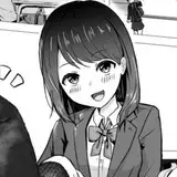
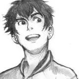
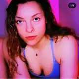
While pondering on how to narrate this story, I noticed that oftentimes, when we reminisce about the past, there are certain triggers that prompt us to do so. I've simplified these triggers into three categories: people, places, and things. For instance, meeting childhood friends again as adults, revisiting places that hold significance with someone from the past, or encountering objects gifted by someone long ago. These elements are what I want to focus on and share in this exhibition.

Technique
After I had the content I wanted to share, I started thinking about how I could enhance my artwork. Typically, I enjoy interactive artworks, especially those involving print. I believe they can significantly add value and depth to the exhibition. While researching, I came across an old book from my childhood about detectives and puzzle-solving. In it, there was a section on Red Reveal, a game many people might have played, where words or images are hidden in red patterns or pictures. To reveal what's hidden, you need to use a red lens to look through. I felt this technique perfectly aligned with the content I wanted to convey. Having hidden content within an image, and requiring viewers to use a lens to perceive the story underneath, seemed like an excellent fit. Therefore, this will be the primary technique I'll use for this series.

Risograph Printing
Another aspect I'd like to share is about the printing technique, which is crucial to my artwork. Using a red lens with red printed colors requires close matching. After test printing, I found that achieving vibrant and bright red colors similar to those on an iPad screen is quite challenging. It might be necessary to adjust the tone towards a more pinkish hue, but this could potentially compromise the summer vibe I intend to convey.

In the past year, several artists have increasingly utilized Risograph printing, a technique reminiscent of the 1980s. For those unfamiliar, Risograph printing involves creating master plates and limiting color usage. However, Risograph printing allows for brighter and more vibrant colors compared to traditional inkjet or laser printing. During color testing, I experimented with red and fluorescent orange for the reddish-orange parts. The red color, as intended, disappeared under the red lens, but the fluorescent orange unexpectedly appeared brighter. This could be due to the special properties of fluorescent colors, which can appear brighter than white paper under a red lens. It's a fascinating effect that adds more meaning to the image. Instead of the original effect where the past image seems to disappear and the current image becomes clearer, it becomes a shadow that embraces the past image. I believe this adds a new dimension to the effect. In the end, we decided to use a combination of yellow and fluorescent pink to achieve a bright orange color suitable for summer.

The process of brainstorming for this project might not have delved deeply into many aspects because I still have much to study. However, this project has been a great learning experience for me. From now on, I would like to invite you to see all four pieces that I have brought for exhibition.