SamSuka
EchoGame
EchoGame

patreon


Moving Forward

So I lied; the vote did affect the direction of the project.


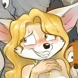
After reading the critique and talking with my team members, I've decided to abandon the vision I had for Echo's art style. At this point we will choose a style that "makes sense". I feel good about this because doing that will allow me to move forward on the project without feeling like I made a mistake at the start.


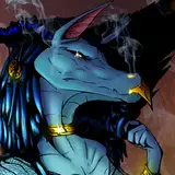
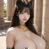
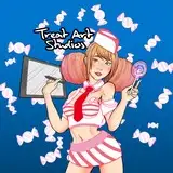
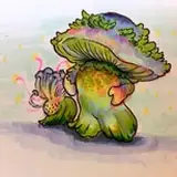
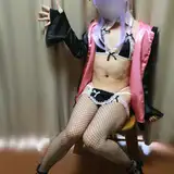
Check out the attachments for one of the styles we're considering by ScratchelCharge on FA.


In other news, I'm still editing my way through Carl's route. Had some difficulty with writer's block for the past few weeks, but I think I've finally got something that I can polish up and deliver within the next few days. On top of that, some of you can expect Bonus Story #2 sometime this week or next. This one will be from the point of view of Leo.


I gotta be honest, after a while it's hard to tell if anything you've written is worth a damn, but I just hope for the best!


-Howly

Moving Forward Moving Forward

Comments

I actually think the new style was good. It simply needed a little more realism, with less blocky, cartoonish looking features. For example, Leo's eyes need to appear a little smaller/more realistic, as well as Jenna's, and TJ needs to look more symmetric (snout looks kinda off). I also think maybe a example of a sad, worried, or even neutral pose could really change people's minds, demonstrating how the characters look more real when they aren't in a happy pose. This new Leo and TJ from scratchelCharge does not fit at all, in my opinion. But I guess my main point is that not everyone will ever be satisfied. There will always be people that hate the new art. Some people are tied to the original sprites (even though it seems like they weren't intended to be final sprites), some other people likes some of the first sketches by Leone (my personal favorite). I think that you all should follow the main points that everyone is making, and go from there. From reading a lot of the comments, it seems most people agree that the sprites need a slightly dark but still fun, somewhat real looking art style. Maybe have a post listing different features that potential sprites could have and ask everyone to lists the all the features they want. Then take the top features and use them in the new sprites. And if not everyone likes the new sprites, that's fine. They will eventually grow on those people, and if the sprites hit those main features everyone wants, what more could people ask for? I also wanted to say I really appreciate you working with patreon supporters to find a good style. It really shows how you all care about our input and really try to work with us. Thanks!

Eh. The slightly bulbous nose on Leo that is not the proper nose shape for a wolf and TJ's own unique safe blandness notwithstanding, I can live with this. I did like the concept of implied juxtaposition wanted between art style and story, even if I did vote negative on that last patch of artwork. I would've been more than completely fine with Tuler from the getgo. And alot of Leone's work, especially with Flynn, was stellar too even if it was less cartoonish than what was planned at the time. Ah well. Sorry to hear about the block but the best way to handle it is to write something, anything, every day so it's formed like any other habit. Even if it's just a single page short story. Gets to a point where going 24 hours without writing is what's weird and makes it easier to keep the flow going once it starts.

Gryzmon

I like the TJ one. Leo's nose seems to curve up but otherwise it's fine.

Mechwarrior

Now the cheek fluff things on TJ I'm not digging. It's a little too much, I think... If it was toned down a bit it I think it would work better.

A shame. I was really starting to like the new style, (although I can see why others didn't) I also like the new concept design too. It's good that you are taking the opinions of your fans and supporters into consideration, but at the end of the day you have to be true to yourself. Remember the moral of Aesop's fable "The man the boy and the donkey" is that when you try to please everyone you end up pleasing no one and lose your ass in the process. Everyone is different and will not all like the same things. And don't worry too much about Carl's route, if history is any indication it will be just as good the rest of them.

Richard

I'm sorry that the contrasting style didn't garner more affection. I liked it personally, but I'm glad you're able to move forward with a new style that hopefully more people will like. I don't think many people will be too upset with a lack of updates if it allows you to give us a quality story. This new sprite style looks very nice, I think it looks a lot more serious, which I hope people will like. Anyways, as always, keep up the amazing work!!

Ryo

I love the new sprite :D There really isnt anything i can complain about on it. Which is fantastic. And don't worry Howly, if it's anything like what has been previously written, then it's worth at least several damns :)

afoxbutt

I have nothing against the author follows their vision and I felt bad too )=, since that is what VNs are for (following one's vision rather than a committee). But I will try my best to give my opinion (oh, how hypocritical of me...). One thing that irked me about the last time's sprites is that it was too absurdly fast to be final. At least the must be some more options for styles until reaching the final consideration. As for Leo sprite, I think I kinda like it, it seems more mature and not too cheesy at the same time (I admit it is so far way better than the first two). I may second Joseph but there is always a room for improvement, right? =D

Nate

The other sprites were fairly good, but this type also has its own special vibe. Will you make another poll for the different art styles you consider,

Sign Dhole

I feel bad for knocking Howly's vision, but I am looking forward to seeing the new styles! This Leo looks alright. Looks a little ratty with the big nose and whiskers. And by ratty I just mean as-in like a rat. His snout is maybe a little too thick. Oh, if you look at it really closely, the jaw and teeth look a little misaligned. But he looks good! Looks fluffy and nice. Writer's block is awful. :/. No idea what that's like for a writer, but man. Hope it does go and stay away. I really like the writing so far! Looking forward to Carl and Leo's stories!

Joseph Goldthorp

I was a fan of the other sprites because I enjoyed the art style and I could see where it would work when the expressions would change but this one does look quite a bit more realistic. While I liked the other sprites this one just feels better. I like it.


More Creators