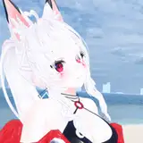
‚ÄĘ Download the full process image from attachment.
‚ÄĘ The full illustration is available as an HD 2+ reward. See this post to know how to receive the reward.
‚ÄĘ Attachment version is smaller than HD 2+ version. (1000 px in width vs 1600 px)
‚ÄĘ ŚĺěťôĄšĽ∂šłčŤľČŚģĆśēīÁöĄťĀéÁ®čŚúĖÁČá
‚ÄĘ ťęėśłÖŚģĆśąźŚúĖÁāļťôźśôāHD 2+ÁćéŚčĶԾƍ©≥śÉÖŤę茏ɍÄÉś≠§ÁĮáśĖáÁꆄÄā
‚ÄĘ ťôĄšĽ∂ŚúĖÁČáśĮĒHD 2+ÁćéŚčĶÁČąśú¨Á®ćŚĺģŚįŹšłÄšļõ„Äā(ÁłĹŚĮ¨: 1000px vs 1600px )
Paintstrom studio / Cintiq pro 24"
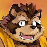
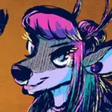
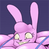
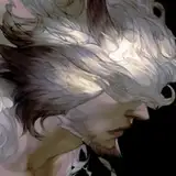
It's not hard to know who he is if you've known my OTP. *wink*
Śüļśú¨ŚŹ™Ť¶ĀÁü•ťĀ≠Ś≠źÁöĄOTPťÉĹśúÉÁü•ťĀϜÉ≥Ť¶ĀÁēꍙį

# Rough idea and the initial sketch ŚąĚś≠•śßčśÉ≥ŤąáŤćČÁ®Ņ
Starting by drawing random poses. I used to prefer bigger and more transparent brushes for rough sketches; recently I found it is actually harder for me to finish. So on this one, I'm practicing using smaller brushes with no transparency (but slightly textured).
ŚŹćś≠£šłÄťĖčŚßčŚįĪśėĮťö®śÄߍá™ÁĒĪšļāÁēę„ÄāÁõīŚąįśĄüŤ¶ļŚįćšļÜŚįĪśėĮŚįćšļÜ(Ś•ĹÁĪ†ÁĶĪ) ŚĺóŚąįŚĖúś≠°ÁöĄśßčśÉ≥šĻčŚĺĆŚÜćŚÖ∑ťęĒÁēęŚáļśõīÁĘļŚąáÁöĄśßčŚúĖ„ÄāťĀéŚéĽśąĎÁŅíśÖ£ÁĒ®ŤľÉŚ§ßšłĒšłćťÄŹśėéŚļ¶šĹéÁöĄÁ≠ÜŚą∑śČďÁ®ŅԾƌĺĆšĺÜÁôľÁŹĺŚŹćŤÄĆśúÉŤģό幝õ£ŚģĆÁ®ŅԾƌÖ∑ťęĒŚéüŚõ†śąĎšĻüšłćśėĮŚĺąÁě≠„ÄāśúÄŤŅĎťÉĹŚú®Á∑īÁŅíÁĒ®śĮĒŤľÉŚįŹšłĒšłćťÄŹśėé„ÄĀŚł∂šłÄťĽěśĚźŤ≥™ÁöĄÁ≠ÜŚą∑śČďÁ®Ņ„Äā

# Adjusting pose and clean the messy lines Ť™ŅśēīśßčŚúĖŚíĆśłÖÁźÜťõúÁ∑ö
The pose of the initial sketch seems too relaxing and emotionless. I like to use body languages to provide some depth of his personality, and I want to make him looks a bit insecure.
I'm using neutral lines to do the sketch so I won't be distracted to refine those lines and miss the whole composition. If the composition is bad, it's not worth to be refined.
ŚąĚś≠•ŤćČÁ®ŅÁöĄŚßŅŚčĘśĄüŤ¶ļšłćŚįć„ÄāŚßŅśÖčťĀéśĖľśĒ坨ܚłĒÁľļšĻŹśÉÖśĄü„ÄāśąĎŚÄčšļļŚĖúś≠°ÁĒ®ŤļęťęĒŤ™ěŤ®ÄšĺÜŤ©ģťáčŤßíŤČ≤ԾƍÄĆťÄôŚľĶśąĎśÉ≥ŤģĖÁúčŤĶ∑šĺÜÁ®ćŚĺģś¨†ÁľļŚģČŚÖ®śĄüԾƌą©ÁĒ®Á∑䌾ĶŤąáŤ∑ĚťõĘśĄüŤ£ĹťÄ†šłÄťĽěÁēęťĚĘŚľĶŚäõ„Äā Śú®ťÄôś≠•ť©üÁöĄŤćČÁ®ŅԾƜąĎÁõ°ťáŹÁĒ®śĮĒŤľÉšł≠śÄßÁöĄÁ∑öśĘĚ...ŚóĮ...ťāĄśėĮŤ©≤Ť™™śĮĒŤľÉÁĄ°ŤĀäÁöĄÁ∑öśĘĚÔľüÁłĹšĻčŚįĪśėĮŚŹ™Śįąś≥®Śú®śääśēīťęĒÁĶźśßčÁēꌕĹÔľĆÁõ°ťáŹťĀŅŚÖćśääťõÜšł≠ŚäõśĒĺŚú®„ÄĆśÉ≥śääÁ∑öśĘĚÁēęŚĺóśõīŚģĆśēīśõīśľāšļģ„ÄćԾƍÄĆÁĒ®šłÄšļõÁ≤óÁīįŚĹąśÄßšĹéÁöĄÁ≠ÜŚą∑śĮĒŤľÉŚģĻśėďťĀĒśąźťÄôŚÄčÁõģś®ô„Äā šĻüŚįĪśėĮŤ™™ÔľĆŚú®ťÄôś≠•ť©üśąĎŚŹ™ŚįąŚŅÉśÄĚŤÄÉÁĶźśßčԾƍÄĆšłćśėĮŚéĽśÄĚŤÄÉÁ∑öśĘĚŚ§†šłćŚ§†śľāšļģ„ÄāÁĶźśß蚳挕ĹÁúčÁöĄŤćČÁ®ŅŚį朹ϚĺÜŤ™™šĻüś≤íśúČÁĻľÁļĆŚģĆśąźÁöĄŚÉĻŚÄľ„Äā

# Inking(not really), adding wings šłäŚĘ®Á∑ö(ŤÄĀŚĮ¶Ť™™šĻüšłćÁģóšłäŚĘ®Á∑ö)ԾƜ∑ĽŚä†ÁŅÖŤÜÄ
I 'adjust' the final sketch from light green to black. And then, well, just brainlessly refining every line. So basically my final sketch and 'inking' is on the same layer. And oh well I made a mistake on my final sketch, that the wings are not defined enough and his anatomy is a bit off. So the right part is me correcting his body and create a new layer to remake a sketch for the wings.
ŚĖģÁīĒŚįĪśėĮśääśłÖÁźÜŚ•ĹÁöĄŤóćŤČ≤ŤćČÁ®ŅÁõīśé•„ÄĆŤ™Ņśēī„ÄćśąźťĽĎŤČ≤ÔľĆÁĄ∂ŚĺĆśÖĘśÖĘśääÁ∑öśĘĚšŅģŚ•Ĺ„ÄāšĻüŚįĪśėĮŤćČÁ®ŅŚíĆŚĘ®Á∑öÁ®ŅŚÖ∂ŚĮ¶śėĮŚźĆšłÄŚÄčŚúĖŚĪ§„ÄāšŅģÁ∑öśĘĚś≠•ť©üŚĺąÁĄ°ŤÖ¶ÔľĆŚŹćś≠£ŚįĪśėĮśÖĘśÖĘšŅģŚąįÁúčŤĶ∑šĺÜÁąĹÁāļś≠Ę„Äā šĹÜŚú®ŤćČÁ®ŅťöéśģĶśąĎÁäĮšļÜšłÄŚÄčťĆĮԾƝā£ŚįĪśėĮÁŅÖŤÜÄšļ§ŚĺÖŚĺ󌧙ťö®šĺŅԾƜČÄšĽ•Śä†ťĖčśĖįŚúĖŚĪ§ÔľĆťáćÁēęšļÜšłÄś¨°ÁŅÖŤÜÄÁöĄŤćČÁ®Ņ „Äā

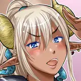
# Finalization ŚģĆÁ®Ņ
Not much to say about these steps. Finishing the wings is the hardest part and I guess it's because I'm not familiar enough with drawing wings. And uh, I suck at shading.ūüė© So I tend to only rely on linework and just make it clear and appealing enough to be a finished art.
ÁĄ°ŤÖ¶ŚúįÁĻľÁļĆŚģĆÁ®Ņ„ÄāťõĖŤ™™ÁĄ°ŤÖ¶šĹÜťāĄśėĮŚĺąŤÄóÁ≤ĺÁ•ěŚäõԾƌŹĮŤÉĹśėĮŚõ†ÁāļŚ§™ÁĄ°ŤĀä„ÄāŚ¶āśěúÁēęśľęÁēꌏ™ťúÄŤ¶ĀÁēęŤćČÁ®ŅŤ©≤Ś§öŚ•Ĺ„ÄāśąĎťĚ쌳łšłćśúÉŚ°óťĽĎŚíĆšłäÁĀįťöéԾƜĮŹś¨°śĒ匧™Ś§öÁĀįŤČ≤śąĖťĽĎŤČ≤Ś°äšłäŚéĽťÉĹŤ¶ļŚĺóŚíĆÁ∑öśĘĚÁöĄÁĺ霥üŚĺąŤ°ĚŚļ∑„ÄāśČÄšĽ•Ś°óťĽĎŚįĪťĽěŚąįÁāļś≠ĘŤÄĆŚ∑≤Ծƌ¶āśěúśėĮÁēęśľęÁēęÁöĄśÉÖś≥ĀŚįĪť†āŚ§öŚÜćšłäŚÄčÁ∂≤ťĽě„ÄāśĒ∂Ś∑•ÔľĀ