“LET THE WIZARD DO THE TALKING”
Added 2018-09-08 00:39:08 +0000 UTC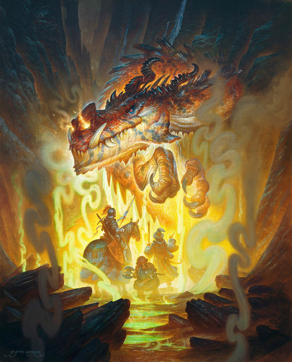
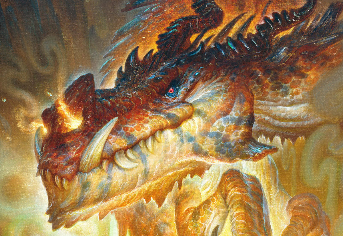
So you’re making your way to the grocery store for pop tarts and there’s a dragon blocking the pass...
Today I will be going through a few of the development stages for this painting to share some ideas on how you might get around a situation like this.
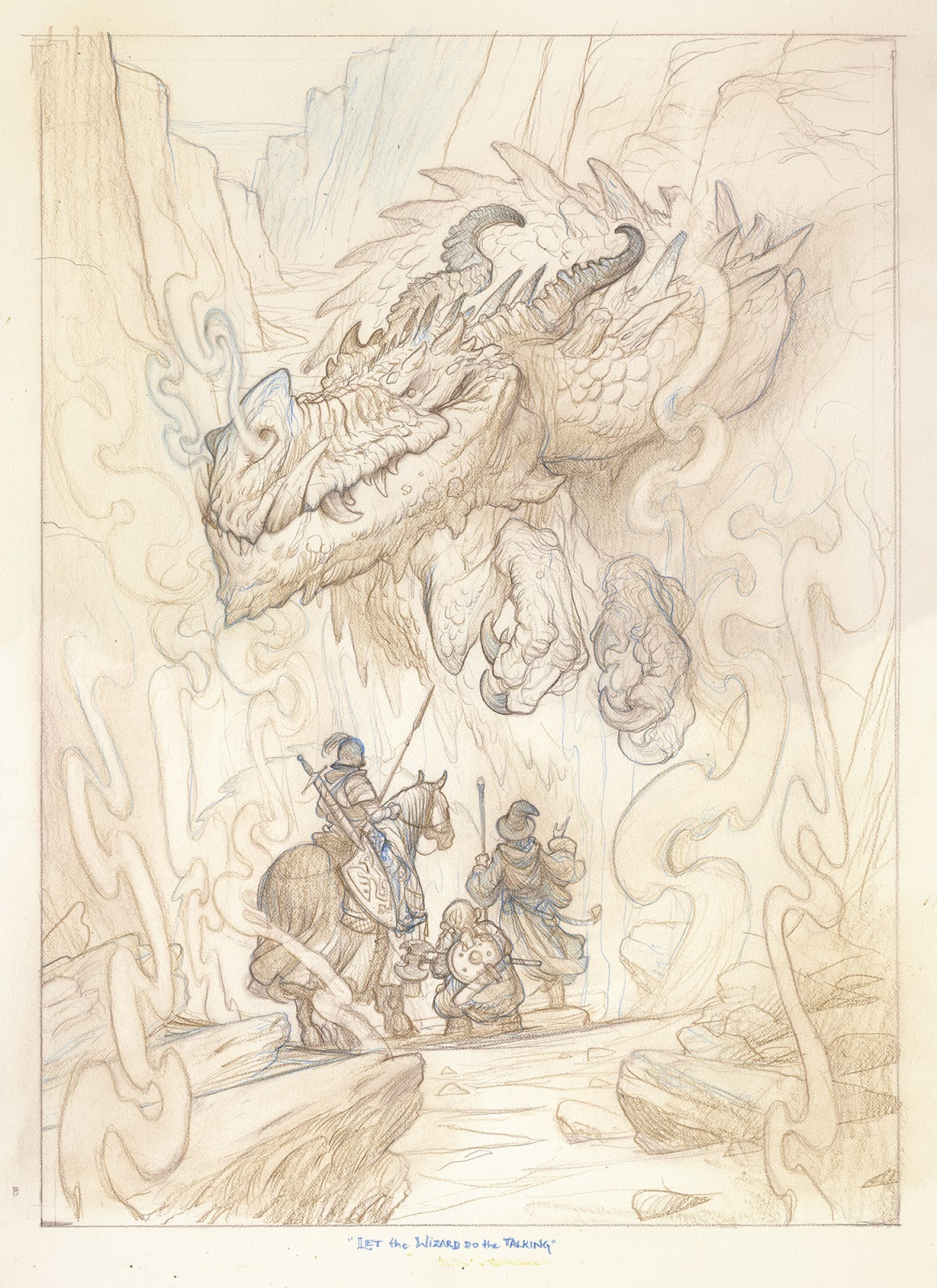
Line Drawing
The 16″ x 20″ drawing was done on the highly reliable Strathmore 500 vellum bristol. Still one of my very favorite papers to watercolor on. It’s only flaws: it is too nice to people, and works too hard while on the job.
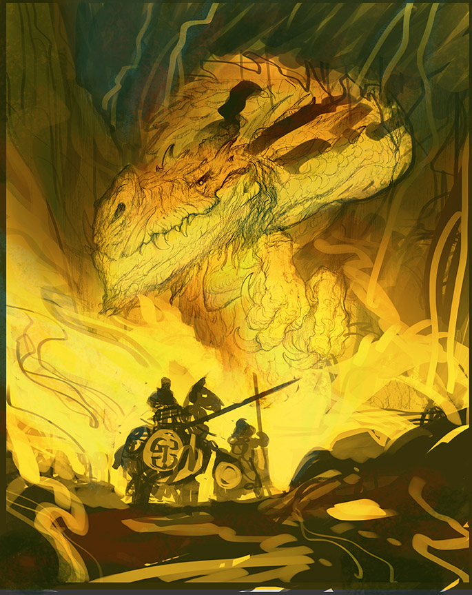
Digital Color Comp
My color comp is fairly saturated here, and perhaps a bit ambitious for a palette choice for watercolor on bristol. I won't be able to get this saturated in watercolor because I’m not an actual wizard. I’m just an average guy who happened to win a wand in a game of No Limit Texas Hold ‘Em once while running guns in Peru.
Even though I know I am unlikely to hit this kind of saturation in watercolor, I still have it as a target for the eventual colors I will be adding digitally later on. While I am working in watercolor I will print out a black and white version of this color comp to use as a general value guide and will revisit this color comp when I scan the final image in.
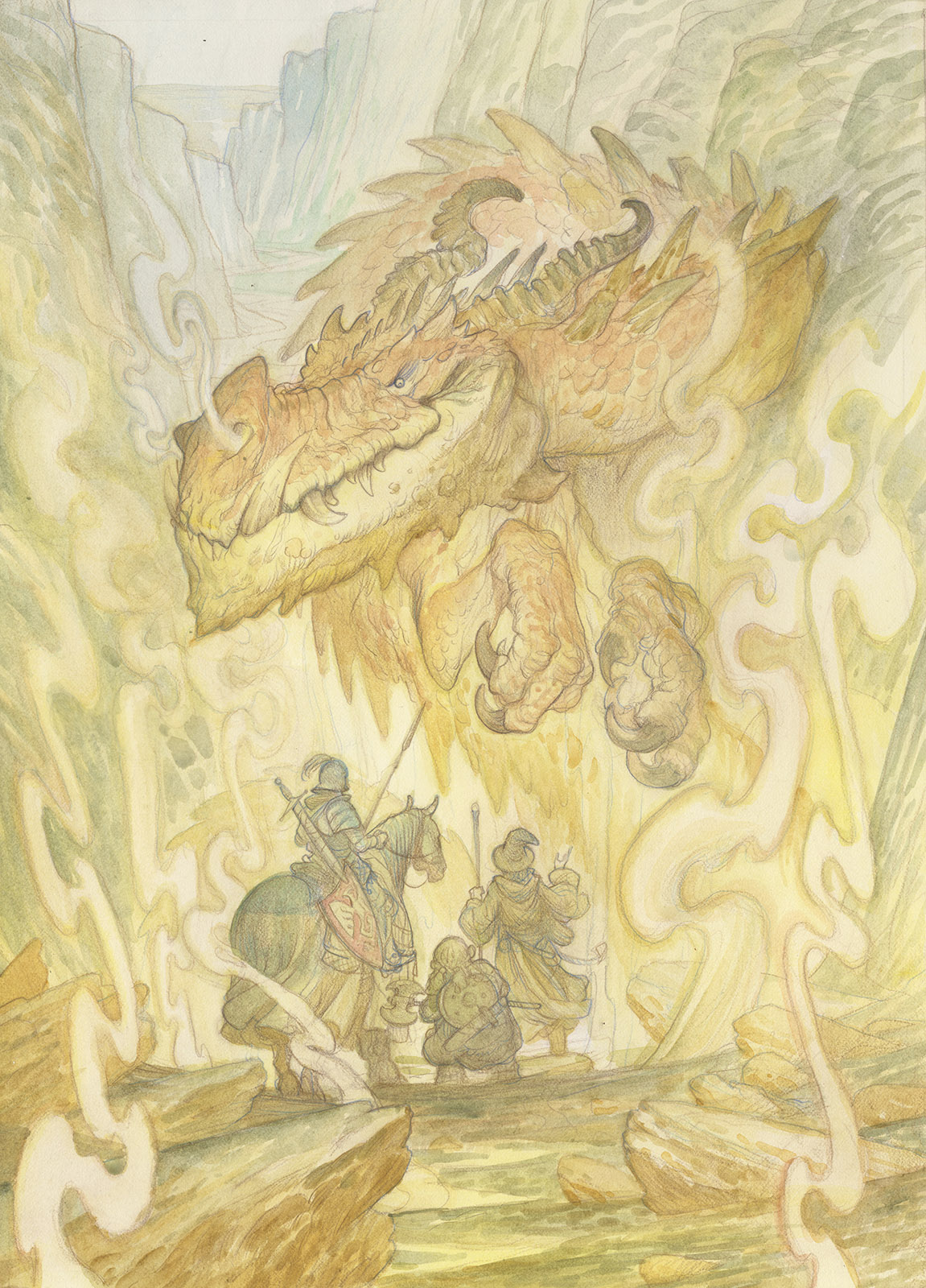
Watercolor
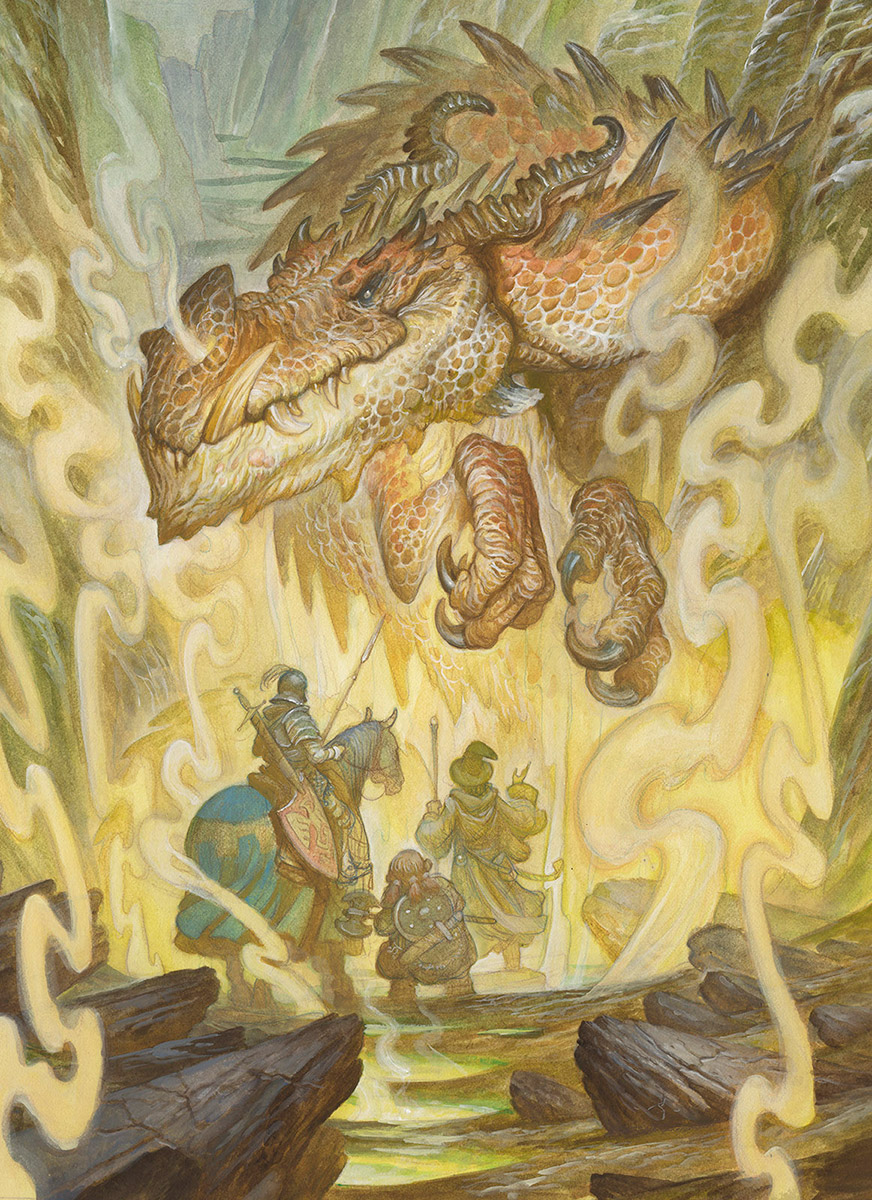
Finished Watercolor, detailed in Acryla-Gouache
After finishing the watercolor itself I lay in opaque passages and highlights using Holbien Acryla-Gouache, which blends really well with watercolor. It offers the smoothness of gouache, but the permanence of acrylic. You can see in the images above how much of the detail and dimensionality the Acryla-gouache brings to the image. I will say that this product is noticeably less smooth than gouache and watercolor alone, but I find that I have an easier time controlling it than I do gouache. It works well for what I need it to do.
The image below shows the stages of the painting:
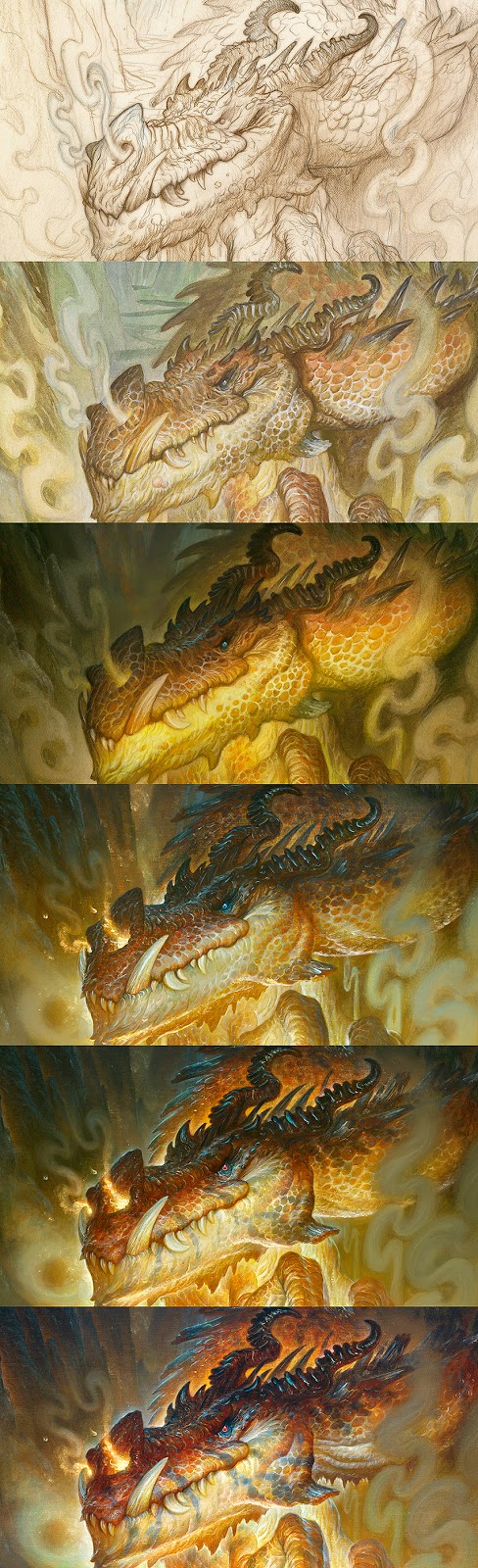
- The order of events:
- Drawing in Caran D”Ache Pablo Pencils
- Watercolor and Acryla-gouache
- (Photoshop) Multiply and Soft Light Layers
- (Photoshop) Color Dodge layers
- (Photoshop) Screen layers with saturated colors
- (Photoshop) Opaque Normal layers
There isn’t a great deal that changes from the watercolor to the digital final. It is mostly that the values and colors are punched up and sharp details refined. However, this last part is hard for me to overstate. I have the approximate vision of a mole rat, or a very deep sea-dwelling creature. Being able to zoom in close to the image means that I can finally give these details the treatment they deserve.
The bulk of the time is spent working on highly transparent layers to bring more vitality and dimensional heft to the image.