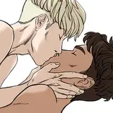
Julia is sick of working late. She's sick of being disrespected, and most of all she's sick of her boss. Lance is a burned out, smooth-talking playboy, but he also happens to be the son of the CEO.
When Lance pushes her buttons once too often, Julia is tempted to put him in his place – but is it worth throwing away her career for a moment of satisfaction?
Content:
-F/M
-dom
-degradation
-small penis humiliation
-directed masturbation
-power play5k words, EPUB and PDF format
Only $3, Releases later tonight! you can go read the first two pages on the shop page!
i've mentioned a couple times now that my editor and the author of roger crenshaw: the dogs at duskfall is now available for freelance work for people other than me, but i don't think i've made as big of a deal of how he's ALSO going to start releasing his own smut shorts on the last friday of every month! he is SUCH a talented writer on top of being an excellent editor and it's my absolute delight to work with him on the cover for his first release. FINALLY i have a great answer when asked "is there anyone else writing smut like you?"
and since this was the first time in a while i went through a cover design process that wasn't just me making one for myself, i thought i would go into how it went!
R/L wanted something that didn't visually describe the characters, because he had deliberately avoided that himself in the text. these characters are archetypes, ideas of characters: a woman who works in an office and her playboy burnout boss. for an erotic fantasy scenario, not going into detail can be ideal, as it allows the reader to project their own fantasies onto the characters. but what does that mean for a cover, when showing off the characters is often the point?

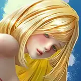
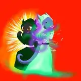
it means silhouettes, babie! if you're a reader of romance you've probably seen this approach a few times. silhouettes allow you to give the impression of a character without actually specifying them. HOWEVER! that can only go so far. note the female silhouettes in the left and right thumbnails--one with a pony tail, one with her hair down. these two very minor design elements say completely different things about the character, and pin her design down into something specific. (there is a whole line of feminist thought about this, that there is no such thing as an "unmarked" woman, or rather a woman whose presentation does not say something about her, ie a woman not wearing makeup is not perceived as neutral the way a man not wearing makeup is).
so anyway including her in the cover in full doesn't work for the prompt, because how she wears her hair or how she dresses would say something about her that we don't want to say. thus: we chose the middle design!
a man in a shirt and tie are super archetypal, and """neutral""" enough to not say anything specific about lance, our male protagonist, other than he has a job and is of average size (which are of course not technically truly neutral, but for our purposes, are functional as symbols). and while a long, narrow, leg does still say something about julia, it is abstracted enough to simply represent the concept of "woman" without projecting an overall image of her in the reader's head. she has a leg, and she wears high heels. that's all you get!

now we can move on to the sketch stage! this is the point at which the palette and text are figured out. i tried a few fonts before landing on one that had the retro paperback all-caps feel that i liked, and i used what i believe to have been a risograph print texture from retrosupply.
we went with the text up top rather than at the bottom, because it lends weight to the shoe and balances out the blacks in the pants. it also allows the figure to take up more of the cover, which is ideal. honestly, not a whole lot to say about this bit that i didn't cover in thumbnails: which is the point of doing thumbnails in the first place!
well you can just scroll up to see that one. the final colors ended up a little less saturated, a little cooler, to bring it home to the retro paperback look i was going for and tie the colors together. i'm very pleased with it and had a lot of fun. cover design is one of my favorite parts of putting out books, and it was especially fun working with someone else to bring their vision to life.
anyway, you should go buy this book! it's only three dollars and i want to make more covers for these! your purchases would prove that i am a very good investment as a cover artist >:)
Krunk
2024-03-29 06:20:07 +0000 UTC