How I approach character design
Added 2023-10-13 13:02:19 +0000 UTCBehind the Scenes 10.2023

I wanna preface this by stating the obvious: I'm not a professional concept artist and take everything I say here with a grain of salt.
I've made a good number of designs I'm proud of and a lot of designs I'm not quite satisfied with.
So this isn't a guide, but a collection of notes about my personal process, what I've found works for me and what doesn't.
Here's what doesn't.
Shapes
They say good character design is all about shape language but I say that's a crock of shit. Well, not entirely, of course, but I believe that principle is overrated if you're not doing designs for literal kids' media.

Rei and Asuka are both iconic. But is there much shape language going on between the two? Hell no, they're the same exact model with a different wig and colour scheme. Yet they still totally work!
Of course, shapes are nice when used in moderation. But you can easily get a cool and memorable (a. k. a. "good") design without doing the whole round means friendly, square means serious, triangle means dangerous ritual.

Hell, Katya's whole hairstyle is made up of squares and she's the friendliest character in PAFL.
So I believe shapes work best when defining a unique silhouette instead of translating information about a character's personality. The latter tends to feel too simplistic AND - dare I say - boring to me outside of kids cartoons.
So this is a sort of warning that I'm not going to focus on this aspect too much.
Value balance
What I've figured out matters most to me in character design is the balance of values. By "values" I mean the artistic term, or the lights and darks of the drawing.

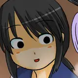
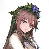
A simple way to check your values is by applying a binarization filter to your artwork or character design, which will split it into clear light and dark areas.
In most cases, if the design looks decent under binarization, it will look decent in colour. Making designs in grayscale first can also really help with finding the right balance.
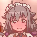
For example, doing that for the little design in the image above shows that it could use a tiny bit of lighter values at the bottom.

This is also why a lot of my designs (especially the ones you see in my older songs) are pure black and white. It's simply easier to balance them that way!
Colour
Colour balance is another important aspect to me, though values still take precedent. You can technically first make a design in grayscale and then colour over it.
However, it's not always as simple as picking a hue and then making it light or dark enough.

For one, a very saturated red and a dark, more muted shade can both be reflected as the same darker value (especially if you're checking the balance using the binarization method).
But the vibe will be completely different, and so will the colour balance. You need to keep this in mind.
I usually start with picking one or two base colours, then one accent colour and applying it at the character's top, middle and bottom.

For example Dmitry's "runaway" design didn't look quite right to me until I made the soles of his shoes the same red as the bags under his eyes and the red of his jacket.
The same balance is maintained in his "facility" design, thanks to the red mutant number and his red socks.

Similarly, Anya's design didn't feel complete until I made her boots the same yellow as her war paint, jacket accents and undershirt.
Things like this can really help bring a design together. This isn't a rock solid rule, though - a lot of my characters follow it pretty loosely.

The thing is, making the character's outfits too matchy-matchy can look cheesy and cartoonish, especially if you're going for a more realistic tone.
You also don't need to stick to the face-body-feet formula for placing the colour accents. It's just good to keep them spread out somewhat evenly across the character's body if possible.

Sometimes I use multiple accent colours, sometimes the colours that form the same accent combo are not exact matches (e. g. Tsar's ginger hair colour isn't the same red as his hoodie pattern and his pants, but they fulfil the same role).
In general, I try not to use more than 3 colours in a character's outfit - this includes black/dark grey. It's easier to draw and balance.
It also makes it easier to have characters look nice as a group by having a throughline of similar accent colours: the PiP and PAFL trios were specifically designed to look good together.
This principle is also part of the reason why I love sports clothes so much - it's very easy to add natural streaks of simple colour to them!
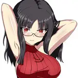
Faces
I have a pretty bad case of same face syndrome with a lot of my characters. One way I circumvent it is through facial accents.
I try to create some sort of facial point of interest for every character that I draw. It's a simple detail that adds focus to the face. I prefer to add one around the eyes.

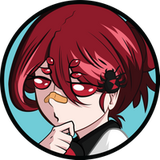
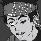
Sanya's red eyebags, Temnova's blue eyebags, Anya's yellow warpaint, Dmitry's red eye rims, the yellow on the edge of Sergei's eyes, the red on the edge of Arthur's eyes are all examples of this.
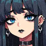
More natural examples of the same facial points of interest include Katya's freckles, Tsar's freckles, Yura's thicker and darker eyebrows, Olya's bangs, and Nikita's glasses & neck scar (not exactly face, but you rarely see one without the other).

Have you noticed how Yura sometimes gets these little whiskers-like things on his cheeks? These served the same purpose - at times his face just felt empty.
Now I rarely draw them since they tend to look too cutesy and the scar solves the problem of him having no prominent facial accent under the eyes.
All this helps make even my fairly simple (nice way of saying generic) characters look recognisable enough as portraits. Plus it's just appealing and gives the eye something to latch onto.

TLDR a Ferry character without some shit on their face is like an angel without wings. Or like a Touhou girl without a hair accessory.
Fine, shapes
Like I said, I don't base my designs on shape language. However, they're obviously useful when you want to create a nice silhouette, reinforce the value/colour or push a certain vibe.

The most obvious PAFL character that sorta correlates with basic shape language is of course Sergei, the square man himself.
His design (haircut in particular) got more rectangular over time. That was less to reinforce that he has a stick up his ass, and more because it's easier to draw - plus gives his head a more defined silhouette.
But then again, all of my men look a little bit squarish.

My demon characters are rare examples of me giving a damn about shapes. See: Ron. He's a big guy as is, but the long coat makes him all the more imposing.
The little horns somewhat undermine the threatening factor, but I believe it works for his softer, more domestic side without making him look too cute (plus hints at his original form being a beast).

Levi's male form was specifically designed to look very sharp and pointy. Even the angel form was supposed to retain some of that sharpness, though mixed with softer anime girl features.
This is the stereotypical use of the shape design trope that I usually dislike, but I didn't mind resorting to it in this case. After all, the demon story is meant to be mindless fun that shouldn't be taken too seriously. We can be a bit formulaic.
An example of light and somewhat accidental shape language is Sanya's hair.

Her ponytail looks very spiky, and she specifically dons it in moments when she's supposed to be less vulnerable or tries to act tough.
Her silhouette is also much bigger when she's in her "thug" clothes. Though, it's lost some of its initial samurai-like quality because the pants would have to be comically huge.
Another one that comes to mind is the difference between Yura's PAFL and False Disposition outfits. This one was a conscious change of silhouette.

His red jersey is loose and somewhat shapeless, while the jacket and turtleneck sit more tightly on him. It was meant to show a shift in mentality from unmotivated and directionless to a more focused version of himself.
So I do use a bit of shape language sometimes! But just a sprinkle.
Guilty pleasures
Finally, I wanna highlight some design tropes I really like and keep shamelessly overusing.
- Hair vents. They give simple hairstyles that extra something.
- Ahoge, especially of the dorito kind. They're cute!
- Eyebags. They're cute!
- Top heavy silhouette - usually with a big fat jacket. Jackets are cute!
- Sports clothes with bootleg Adidas stripes. Cool, casual, and easy to style - what's not to love?
- Clothes with a simple little logo/text. It's an easy and natural colour accent.
- Colourful lashes. These are so fun to do, especially on girls (because I'm very sexist).
- Droopy eyes on older characters. They look endearing, wise and cool (because I have them).
I considered writing a list of the things that I try not to do in character design, but decided against it. Even the lamest design trope (in my eyes) can work if the actual design is well put together after all.
One thing I can say I try to actively avoid though is making characters too attractive.
I think you can tell when a character is trying too hard to be hot or pretty, so it circles back to being unappealing. So I try to keep everyone simple and a little bit grimy.
And that's all!
***
Thank you for reading this month's behind the scenes!
Apologies to anyone who expected an actual guide, I'm really not the person you should be taking design advice from lol. Still, I hope you enjoyed my rambling🐤
Designing characters is super fun!
Comments
Rare post made on my birthday
Rory T
2024-03-04 19:55:02 +0000 UTCDEMONS!!!!!!!!!!! lovely creatures
Sike
2023-10-18 19:20:36 +0000 UTC