I feel like every non art thing in my life exploded a little bit this week, so thanks for your patience. I think my updates for the rest of the month are going to be kinda rapid fire.
I under estimated the volume of orders I'd have to deal with so I had to start printing and folding more comics!😅 I had to fix the Zapier automations I use to send shipping label information for orders out of gumroad, because it wasn't catching them at first.
Now I'm all caught up and if you placed an order you should have gotten a tracking email from Shippo today!
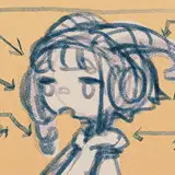
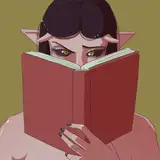
I have a page of cover art thumb nails that are kinda nonsense and I threw out before settling on these two, I'm pretty sure I'm going with the first one.
My process like usual is to throw a bunch of text in my Photoshop document and see which ones feel right.
I kind of think of this old project as being very manga influenced in some small ways, and I got to say I'm jealous of the Japanese for being able to write vertically. I don't like having to throw text across characters, so I'm going to try to at least make it somewhat stylish if I do.
I experimented with some different typefaces for both Libby and Holly but it started to feel a little too chaotic and maybe cheesy? Like with a lot of things, if I come up with a good idea later I'll probably just retroactively adjust all the covers to match 😅
I might add a subtitle for the chapter heading if I can think of one. I am currently rereading Dragonball and Dragonball z and I am very inspired by how low key and simplistic the cover art is for those books. My plan is to take some inspiration from those and make this a more refined version of the interior art, and not go with full-on painting.
Since these are chapter covers, the ultimate version of this story might have a more elaborate cover, but I like the idea of spending less polishing energy on each cover but being able to make more art overall.
Maybe some more one off pinups of the characters like Toriyama has throughout Dragonball!
♥️ Winton
Wuff_Boman
2023-02-17 20:12:05 +0000 UTCWinton Kidd
2023-02-17 16:17:01 +0000 UTCWinton Kidd
2023-02-17 16:15:44 +0000 UTCWinton Kidd
2023-02-17 16:14:56 +0000 UTCWinton Kidd
2023-02-17 16:12:03 +0000 UTCWinton Kidd
2023-02-17 16:06:47 +0000 UTCWinton Kidd
2023-02-17 15:48:08 +0000 UTCRico
2023-02-17 07:51:35 +0000 UTCRico
2023-02-17 07:50:44 +0000 UTCAristotle Fellatrix
2023-02-17 06:49:53 +0000 UTCJ
2023-02-17 04:29:18 +0000 UTCBonerBob
2023-02-17 04:11:51 +0000 UTCLupinsandLaurels
2023-02-17 03:43:36 +0000 UTCAdrien
2023-02-17 03:31:36 +0000 UTCAdrien
2023-02-17 03:29:45 +0000 UTC