


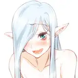
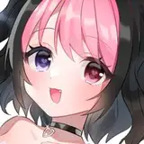
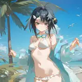
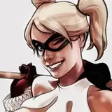
以前pixivやtwitterに投稿したメガテンのマーメイドちゃんの制作過程です。
https://www.pixiv.net/artworks/91993312
履歴データが発掘されたため詳細に説明できる反面、長くなってしまいました・・・
だんだん絵ができていく様子が面白いと思うので頑張ってスクロールしてみてね!
This is the process of making the mermaid that I posted on pixiv before.
Since the historical data was unearthed, I can explain in detail, but it's getting long...
I think it will be interesting to see how the picture is gradually completed, so please scroll down and try your best!
1・下描き Preliminary drawing
目に負担がかからないように青で描きます。
髪の毛は色々修正することが多いので別レイヤーで色分けして描きます。
完成のイメージをその都度文字でメモしておきます。
Draw in blue to avoid straining the eyes.
For the hair, I draw it on a separate layer in different colors, since I often need to modify it.
Make a note of the features of the finished image.
2・線画 Line drawing
黒のボカシのないペンで線を起こします。
後々選択範囲を取ったりするときに便利だからです。
ヒレやドクロは後で加工するので別レイヤーです。
髪は手前や奥、スキマの判別がしやすいように色分けしておきます。
そしてここでもメモメモ。
Use a black unblurred pen to draw the lines.
This is because it is convenient for making a selection later.
The fins and skull are separate layers for later processing.
The hair is color-coded to make it easier to identify the front, back, and gaps.
3・色下描き Preliminary color drawing
完成イメージをメモしていたのですが、軽く描いてしまったほうが解りやすいと思ったので描きました。
下描きの時にやっておいたほうが完成までの迷いが少なくて済むかもしれません。
I wrote down the features of the finished product, but I thought it would be easier to understand if I drew it lightly.
It might be better to do this when you are drafting, so that you are less likely to get lost until you are finished.
4・ベースの色置き Base color placement
線画が完成したら、物質の種類ごとにベースの色を考えます。
これも作業しやすいように別レイヤーにボカシのない色をバケツツールで置きます。
Once the line drawing is complete, consider the base color for each type of material.
To make it easier to work with, place a non-blurred color on a separate layer using the bucket tool.
5・質感・影塗り Texture and shadow painting
ベースの色を置いたら、その色を選択ツールで選択して光の位置を考えながら
(この場合は上(奥)と下から)それぞれ新しいレイヤーに質感や影を描いていきます。
After placing the base color, select the color with the selection tool and draw the texture and shadow on each new layer, considering the position of the light.
(in this case, from the top (back) and bottom) and paint the texture and shadow on each new layer.
6・質感出し1 Texturing 1
光と影の位置が決まったら、更に濃い色で立体的になるよう描き込みます。
ドクロの目もキラーン!とさせます。
Once the position of the light and shadow is decided, use a darker color to make it more three-dimensional.
Make the eyes of the skull glow.
7・質感出し2 Texturing 2
濃い色の次は明るい色で立体感を出します。
肌に赤みをつけて血色を出します。
魚の鱗を表現するために腕と足にテクスチャを薄く貼ります。
岩との間に影を落とします。
ドクロを燃やします。
After dark colors, use light colors. To create a three-dimensional effect.
Add redness to the skin.
Apply a thin layer of texture to the arms and legs to create the scales of a fish.
Cast shadows between the rocks.
Burn the skull.
8・目を描く(ベース色) Drawing the eyes (base color)
目や目の周りはレイヤー分けをすると多く細かくなって面倒なので、白目・瞳・その他の3つのレイヤーにメイクのように描き込んでしまいます。
White eyes, pupils, others
Draw in the three layers as if they were makeup.
9・目を描く(瞳) Drawing the eyes (pupils)
瞳の中に奥行きや深さが感じられるようにぼかしたり濃い色や明るい色を描き込みます。
アクセントに反対色などを入れてみるのもいいかもしれません。
Blur or draw in darker or brighter colors to give the eyes a sense of depth and dimension.
You may also want to add an opposite color as an accent.
10・目を描く(目周り・まつ毛・まゆ毛) Draw the eyes (around the eyes, eyelashes, and eyebrows)
マーメイドちゃんは悲壮感があるのが特徴なので、目の周りを暗くしたり困らせ眉毛を描き込んだりします。
Mermaid-chan is characterized by a tragic look, so darken the area around the eyes and draw troubled eyebrows.
11・目を描く(ハイライト・くちびる) Draw eyes (highlight and lips)
最後にハイライトを入れて立体感を出し、ぷるんとしたくちびるにしてあげます。
Finally, add highlights to give a 3D effect and make the lips look fuller.
12・背景1 Background1
水と岩にそれぞれ薄くテクスチャを乗せます。
Put a thin texture on the water and the rocks.
13・背景2 Background2
水紋や炎をオーバーレイや覆い焼きなどのレイヤー効果で描き入れ、質感を出します。
Water patterns and flames are drawn in using layered effects such as overlay and cover-up to create texture.
14・効果1 Effect 1
下からの青い光をオーバーレイでかぶせます。
光る細かい髪の毛を描き加えます。
Cover the blue light from below with an overlay.
Add glowing fine hair.
15・効果2 Effect 2
上からも光をかぶせて、線の色を全体の色に合うようになじませます。
Cover the light from above as well to blend the color of the lines to match the overall color.
16・効果3 Effect 3
飛び散る水滴と飛沫を描き加えます。
色が強すぎると感じたので調整レイヤーを乗せて全体の彩度を下げました。
Add the splashing water droplets and droplets of water.
I felt that the colors were too strong, so I added an adjustment layer to reduce the overall saturation.
17・効果4 Effect 4
別レイヤーにしておいたヒレを移動ぼかし効果でブレさせます。
Blur the fins on a separate layer with the moving blur effect.
18・合成して完成! Combine and complete!
ーーーーーーーーーーーーーーーーーーーーーーーーーーーーーーーーーーーーー
いかがでしたか?
この絵が最初から描き込まれているものではなく、様々なレイヤー効果や色味の重ね合わせでできていることが分かったのではないでしょうか。
実際は一本道ではなく、下書きや線画の修正や書き直し、光の色やレイヤー効果、全体の色味などなど・・・試行錯誤をしてこの流れになっています。
逆に考えれば、道中色々迷っても最終的にある程度帳尻を合わせることができるのがデジタルの強みだと思います。
What do you think?
I hope you could see that this picture was not drawn from scratch, but was created by various layered effects and layers of colors.
In fact, it's not a straight path, but rather a process of trial and error, with revisions and rewrites of drafts and line drawings, light colors, layered effects, overall color, etc....
On the other hand, I think the strength of digital technology is that even if you get lost along the way, you can make up for it to some extent in the end.
これからもpixivのほうに投稿したものをこんな感じで解説していこうと思っています。
長いスクロールにお付き合いいただきありがとうございました。
それじゃまたね~(^^)/
I'm planning to continue explaining my pixiv posts like this.
Thank you for your patience with my long scroll.
See you later~ (^^)/


