HEY EVERYONE - firstly thank you all for showing da love for the continuation of The Reunion, I'm glad you guys are interested in the story!
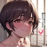
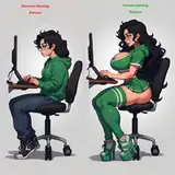
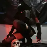
I have a tiny favour to ask. Y'know after sharing the post on here yesterday I was looking at it and somehow the overall aesthetic didn't sit well with me. I think part of the reason is just me not being fully satisfied with the way I draw people (though this will always be a WIP), but another thing I figured could be my use of colours. There's just so much saturation, I think too much of it can be a little unpleasant to look at when it's a series. There's this thing called eye strain xD I recall reading it somewhere by a comic artist who commented on how he picks his colour, so I wanted to try adjusting the colours on mine.
Normally I wouldn't really share my revisions but this one is kind of more obvious and it does somewhat change the overall mood of the comic. It's less orange, I added a "moody" feel to it and decreased the contrast so it looks "flatter", which I think sounds negative but aesthetically I kind of dig it. I really wanna get more opinions on this, would love it if you guys could share your thoughts and which one you prefer since you are the readers, and your feedback matters a lot!
P.S. there are no right or wrong answers HAHA, thanks a ton guys <3
stephattyy
2021-03-20 17:17:45 +0000 UTCSaikô
2021-03-19 17:55:41 +0000 UTCstephattyy
2021-03-18 06:08:46 +0000 UTCCluis
2021-03-17 15:47:14 +0000 UTC