In this article we'll be digging deeper into the topic of tone with an exploration of tonal value - judging how light or dark an area of tone it. We'll just be looking at it in relation to observed tone, prioritising accurate observation and challenging our assumptions about how subjects look by learning to look at them with more focus.
As many drawing materials are monochrome – only able to produce a single colour, or shades of grey, such as charcoal or graphite – removing colour from observed tone is important in order to produce tonally accurate drawings in these media.
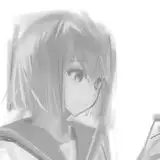
Main image: 'Ariane'
In the context of observational drawing tonal values refer to the overall observed tone, and two things contribute to this. The first is local tonal value, which is the inherent tone that an object, or material, possesses. This could be considered how light or dark an object is between being black, and reflecting little light, to being white, and reflecting nearly all light.

This drawing shows a white, grey and black cube. Each cube has its own local tone, and the observed tones are created by this combining with the light and shadow behaviour.
However, light is necessary to observe anything, and with light, comes shadows. Without light, local tone cannot be perceived. This produces a light and shadow pattern on the subject. Often, the shadow shapes are the first thing that is noticed about tonal values. This can result in a tendency to over-exaggerate the contrast between light and shadow. It is important to consider the range of tonal values that the light and shadow creates for a specific local tonal value, and compare this to objects of different local tonal values.

In this portrait drawing,the lit areas of the dark hair are markedly darker than the shadow areas of the skin.
One of the biggest challenges in observing tonal values is separating them from colour. The intention is to remove colour, and only observe how dark or light something is.

Even though these colour swatches are of equally bright colours, the difference between their tonal values is clear when the colour is removed.
What complicates this is that colour plays a role in the local tonal value. Different colours may have the same brightness (how saturated, or 'pure' the colour is) but will appear differently in tonal values when the colour is removed. Yellow is the lightest colour, with greens and reds sitting in the middle, and blues being the darkest colour.

Once the colour is removed, the remaining image shows tonal values. Note how the yellows are much lighter than the red and green, which are similar in local tonal value. (Source: RitaE, pixabay.com)
So with these observations about value in mind, how can they be translated into a drawing?The first step is to think about the value range that can be produced. In reality, value is a spectrum that goes from black to white, and any tonal value observed sits somewhere on this spectrum.

Spectrum of tonal values, from black to white.
However, the materials used for drawing cannot cover the entire tonal spectrum, and picking tonal values from a spectrum can make it hard to process what we see. Therefore, one approach is to break the spectrum up into a scale of manageable tones.

Common tonal scales are 5 or 10 points. Some artists break down the tonal values they see this way, in order to compare different areas of tonal through an image.
With these scales in mind, a tonal values can be approximately matched and compared. It also allows for the observed tonal values to be compressed down to the range that the materials produce.
An understanding of light and shadow is a useful tool when approaching tonal drawing. Being able to anticipate the behaviour of light helps with spotting more subtle details, and creating a more consistent result.

A sphere showing a light side, form shadow and cast shadow.
Light always travels in a straight line. If an object blocks the passage of light, the area facing the light source is illuminated, and two main types of shadows are created. The first, a form shadow, is created because light cannot reach the sides of the object that are facing away from it. This shadow is darkest when the surface is facing away from the light entirely. When the light direction creates a tangent with the surface, the form shadow starts. This edge is called the terminator. The second is the cast shadow, where an object blocks the light from reaching the surface behind it.

Cast shadow created by a teapot blocking the light source.
The cast shadow is dependant on the shape of the object, the surface it is cast on, and the direction of the light. Cast shadows are good for indicating a lot of information about an object as well as its surroundings, and shouldn't be forgotten.
These are the three most basic tonal areas. However, they do not account for everything that is observed.

Sphere showing the effect of other light and shadow behaviours.
When light hits the surfaces around the object, some of it will get reflected. The form shadow on the sphere is filled in with reflected light, which should be weaker than the original light source. This often leads to a darker tone between the original light source and reflected light called the core shadow. The core shadow created by reflected light, and the shape of the form shadow are important for describing the three dimensional form of a subject.
An occlusion shadow forms in any small gap where light cannot reach, such as where objects rest against a surface, or between two objects pressing together. A small occlusion shadow appears under the sphere, as the darkest part of the cast shadow. Cast shadows may appear to be split into multiple areas, depending on how the subject is obscuring the light source. The penumbra is the total shadow shape, where some or all of the light source is blocked, whilst the umbra is the darkest part of the shadow, where the light source is entirely blocked.

Light and shadow on the figure.
Whilst these ideas apply to light coming from any source, as more diffuse sources and multiple light sources are introduced, the behaviour becomes increasingly complex.

John Constable - 'Male Nude' (Source: Yale Centre for British Art)
This nude figure drawing shows how important light and shadow is to rendering anatomy. This is where knowledge of both areas can play a significant role in drawing. Understanding what the little bumps and undulations shown up by the light and shadow are helps inject a sense of continuity and solidity into the figure. Try to indentify the different types of shadow and light behaviours in this image.

Anders Zorn - Bust (source: Art Institute Chicago)
This etching by Zorn shows how tonal shifts can be portrayed by a build up of hatching marks, even relatively dynamic ones like this. Here, subtle changes in the shadows show form over the face and chest, whilst the arm casts a strong shadow. The build up of marks can describe a fairly broad range of values. The impression of quite light shadow tones, like those around the neck and collar bone, and very dark, near-black tones, like those behind the face, can both be seen.
Recommended Materials: Pencils or charcoal. Any black, white, or greyscale media can be used.
Further Reading: Lesson 04 - Tone
This exercise is best done with white, grey or black objects – try to pick items as devoid of colour as possible and start with simple single objects, like balls or boxes. Use a lamp (a desk lamp is fine) to control the angle the light comes from. Make repeated tonal drawings of the same subject, but reposition the light source each time, changing the angle and height. They is a good exercise for understanding how light affects shadow shapes.

Studies of a cube lit from different angles.
Exercise 2 – Drawing the Figure in Tone
This exercise can be done with photographic reference, or from a life drawing class. Typically, the contours of the figure are drawn before tone is added, though this should be done lightly so as not to interfere with the tone later. As the tone is added, think about how the patterns of the shadow and light shapes are defined on the figure.
When drawing the nude figure, consider the relative range of tonal values that are encompassed by the skin to other areas, such as the hair. For a model with darker hair, skin tones are likely to be much lighter than the hair, even if they have darker skin. Keep comparing different tonal areas.

Tonal drawing of the figure. Note the darker hair tones have been compressed into shadow.
Longer drawings are a key exercise that helps with learning to accurately observe tonal values. Because photography can compress tones, or exclude more subtle variations (printed photos are hugely restricted by the limitations of the ink and paper), it is far better to practise this from real life subjects. Try to work at a reasonable size; A4 or larger for pencil, or A3 or larger for charcoal, to allow for more detail to be covered.
When starting out, it is a good idea to pick relatively monochrome subjects – casts and skulls are common artists' subjects, but if you lack these, white fabric sheets, paper constructions (rumpled paper, boxes, etc) or any other white, grey or black object is fine. Once you are comfortable with these, consider moving on to multicoloured arrangements or objects.

This skull was drawn from life, over the course of several hours.
–
>> Watch the Week 08: Tonal Value main lesson HERE (Student & Life Tiers)
>> Watch the Week 08: Tonal Value demo HERE (Student & Life Tiers)
Find links to the whole Tutored Life Drawing Course HERE